
UI
Estella’s UI is a CSS-like flexbox system solved in the C++ core. You compose an
interface from UI components — visually in the editor or in code — and handle
interaction from your systems. There is no RectTransform: UINode is real
flexbox, sized with px / percent / auto plus Absolute insets.
This page is the overview: the component model, a quickstart, and a map of the detailed UI guides. Deep reference for each area lives in its own chapter.
The components
Section titled “The components”| Component | Role | Guide |
|---|---|---|
UINode |
The layout box; holds the per-item flex fields (size, grow/shrink, margin, inset). | UI Layout |
FlexContainer |
Lays a node’s children out with flexbox (direction, justify, align, gap, padding). | UI Layout |
Text |
Text via a dynamic glyph atlas (content, font, color, align, stroke, shadow, rich text). | UI Text |
UIVisual |
The fill — solid color, texture, 9-slice, tiled, or filled. | below |
UIMask |
Clips its children. | below |
UIScroll |
Makes a clipped node a scroll viewport: the wheel and drags move its content. | below |
Interactable |
Marks a node hit-testable so it can be hovered/clicked. | UI Interaction |
UIInteraction |
Engine-written per-frame pointer state (read-only for your logic). | UI Interaction |
Quickstart: a pause menu
Section titled “Quickstart: a pause menu”A complete pause menu — a centered column panel with a title and a button — built once from a startup system:
import {  defineSystem, addStartupSystem, GetWorld, Res, UIEvents,  spawnUIEntity, createButton,  FlexContainer, FlexDirection, JustifyContent, AlignItems, px,} from 'esengine';
const buildPauseMenu = defineSystem([GetWorld(), Res(UIEvents)], (world, events) => {  // A panel: 320×220 with a dark translucent background.  const panel = spawnUIEntity({    world,    node: { width: px(320), height: px(220) },    visual: { color: { r: 0.08, g: 0.10, b: 0.16, a: 0.95 } },  });
  // Lay its children out as a centered vertical column.  world.insert(panel, FlexContainer, {    direction: FlexDirection.Column,    justifyContent: JustifyContent.Center,    alignItems: AlignItems.Center,    gap: { x: 0, y: 16 },  });
  // A title, parented to the panel.  spawnUIEntity({ world, parent: panel, text: { content: 'Paused', fontSize: 28 } });
  // A button that resumes the game on click.  createButton({    world, events, parent: panel, text: 'Resume',    node: { width: px(160), height: px(44) },    states: {      normal:  { color: { r: 0.20, g: 0.55, b: 1.0, a: 1 } },      hover:   { color: { r: 0.30, g: 0.65, b: 1.0, a: 1 } },      pressed: { color: { r: 0.12, g: 0.45, b: 0.9, a: 1 } },    },    onClick: () => { /* unpause, switch scene, hide the menu… */ },  });});
addStartupSystem(buildPauseMenu);
spawnUIEntity({ world, parent?, node?, visual?, text? }) returns the entity; pass
parent to nest. Sizes use the dimension helpers px, percent, auto — all
in design pixels (see UI Layout).
The other widget factories work the same way: createToggle, createSlider,
createProgress, createDialog, createDropdown — see
UI Components.
How the pieces fit
Section titled “How the pieces fit”Each layer builds on the one before it:
- Layout —
UINodeboxes, solved by the flexbox engine;FlexContainerarranges children,Absoluteinsets place overlays. → UI Layout - Visuals & text —
UIVisualfills the box,UIMaskclips,Textdraws crisp glyphs. → UI Text - Interaction —
Interactablemakes a box hit-testable; the engine writes pointer state intoUIInteractionand emits bubblingUIEvents; drag & drop and keyboard focus sit on top. → UI Interaction - Widgets — factories (
createButton,createSlider, …) compose the three layers into ready-made controls;createListViewadds virtualized lists. → UI Components, UI Lists - Controllers — a named “page” state per UI root with per-page field bindings (tabs, button states, show/hide) — no code. → UI Controllers
- Theme & binding — design tokens skin every widget (live-switchable), and reactive signals keep UI in sync with game state. → UI Theme, UI Binding
UIVisual and UIMask
Section titled “UIVisual and UIMask”UIVisual draws the node’s background; visualType selects the mode:
UIVisualType |
Uses | Description |
|---|---|---|
None |
— | Invisible (layout/hit-test only). |
SolidColor |
color |
Tinted quad. |
Image |
texture, uvOffset, uvScale |
Textured quad / sprite region. |
NineSlice |
sliceBorder |
Scalable panel with fixed corners. |
Tiled |
tileSize |
Texture repeated across the box. |
Filled |
fillAmount, fillMethod, fillOrigin |
Cropped fill (health/progress bars, cooldown rings). |
What 9-slice is for
Section titled “What 9-slice is for”A button drawn at 100×112 and used at 450×130 is stretched 4.5× wide — and the border, the rounded corners and the highlight stretch with it. The frame looks melted, and you cannot fix it by drawing a second image for every button size in the game.
9-slice cuts the image into a 3×3 grid and scales each piece differently:
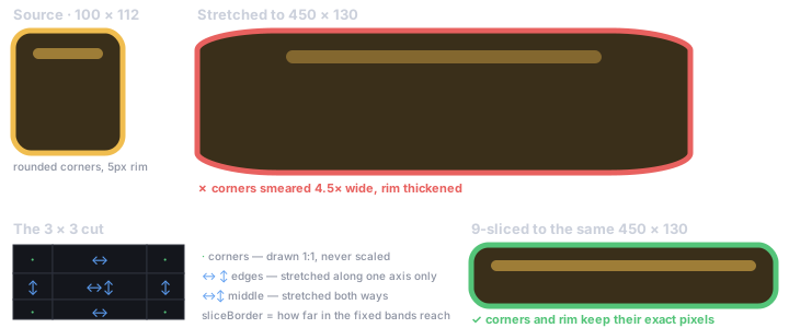
sliceBorder is those four numbers: how far in from each edge the “do not stretch” band
reaches. Corners keep their exact pixels at any size, so one 100×112 texture serves a tiny
tooltip and a full-width banner. The border belongs to the image, not to the entity
using it, so it is a texture import setting — set it once and every NineSlice that
references the texture is sliced the same way. See
dragging the border in the asset inspector.
What a mask is for
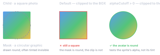
Section titled “What a mask is for”A mask answers “show this content, but only inside that region”. The classic cases are a square avatar photo that has to appear circular, and a scrolling list whose items must disappear at the edge of their viewport rather than spilling over the rest of the screen.
Add UIMask to a node and its children are clipped to that node. By default the clip is
the node’s box — a rectangle. That is enough for a list viewport, but it is why a
circular avatar frame used to still cut a square: the mask graphic was round, the clip
was not. alphaCutoff above 0 switches the clip to the shape the mask actually draws.
UIVisual.enabled hides this entity’s visual only; UINode.display = None
removes the node and its whole subtree from layout, rendering, and
hit-testing. Add UIMask to a node to clip its children to the box.
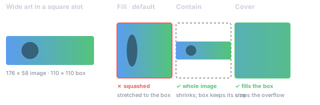
UIVisual.fit — CSS object-fit. By default an image is stretched to its box, so
art whose ratio differs from its slot is visibly squashed. Contain shrinks the quad
until the whole image fits (the box keeps its layout size); Cover keeps the box and
crops the UV instead. Neither ever distorts the artwork. NineSlice and Tiled ignore
it — adapting to the box is their whole job.
UIMask.alphaCutoff — clip to the shape, not the box. A stencil mask clips to the
mask’s rectangle, so a circular avatar frame still cut a square. Above 0 it clips to
the shape the mask actually draws, testing the sprite’s alpha (not the tinted result,
because a mask graphic is routinely tinted to near-zero alpha so it masks without being
seen). 0 stays the default, so scenes authored against box clipping are unchanged.
Subtree opacity and pointer gating
Section titled “Subtree opacity and pointer gating”UINode carries two fields that resolve hierarchically, in the same pass that already
resolves display:
| Field | Default | Effect |
|---|---|---|
opacity |
1 |
Multiplied down the tree like CSS opacity. Fades a whole panel with one value. |
pointerEvents |
Auto |
None makes the node and its subtree transparent to the pointer — still drawn, hits pass straight through. |
These are the “CanvasGroup” knobs: fading a panel used to mean touching every visual’s
color.a, and a decorative overlay had no way to stop eating clicks (Interactable.blockRaycast
is per-entity, not inherited). opacity follows CSS semantics — it multiplies per visual
rather than compositing the subtree offscreen, the same trade every UI toolkit makes.
// Fade a whole dialog out and let clicks through while it animates away.world.set(dialog, UINode, { ...node, opacity: 0.3, pointerEvents: UIPointerEvents.None });Scrolling
Section titled “Scrolling”UIScroll turns a clipped node into a scroll viewport: the wheel and drags move its
content, and the node’s UIMask is what hides the part hanging outside. Content that fits
does not move, so the component is inert until there is something to scroll.
| Field | Default | Meaning |
|---|---|---|
content |
first child | The child that moves. |
horizontal / vertical |
false / true |
Which axes scroll. |
movement |
Clamped |
Elastic overshoots at the ends and springs back. |
wheelSpeed |
1 |
Multiplier on wheel deltas. |
dragScroll |
true |
Drag/touch grabbing, with a kinetic fling. |
decelerationRate |
0.135 |
Fling velocity kept per second; 0 stops on release. |
// A list that scrolls vertically inside a fixed box.const viewport = spawnUIEntity({ world, parent: panel, node: { width: px(400), height: px(300) } });world.insert(viewport, UIMask, { enabled: true, mode: MaskMode.Scissor, alphaCutoff: 0 });world.insert(viewport, Interactable, { enabled: true, raycastTarget: true });
const content = spawnUIEntity({ world, parent: viewport, node: { width: px(400), height: px(1200) } });world.insert(viewport, UIScroll, { vertical: true });   // content defaults to the first child
The component is what a scene can say. Scrolling used to be reachable only by building
the ScrollView widget in code, so a scroll area placed in the editor described all its
parts — the clipped box, the oversized child — without the one fact that it scrolled.
UIScroll is that fact, and the widget and the scene now drive the same container.
Editor or code
Section titled “Editor or code”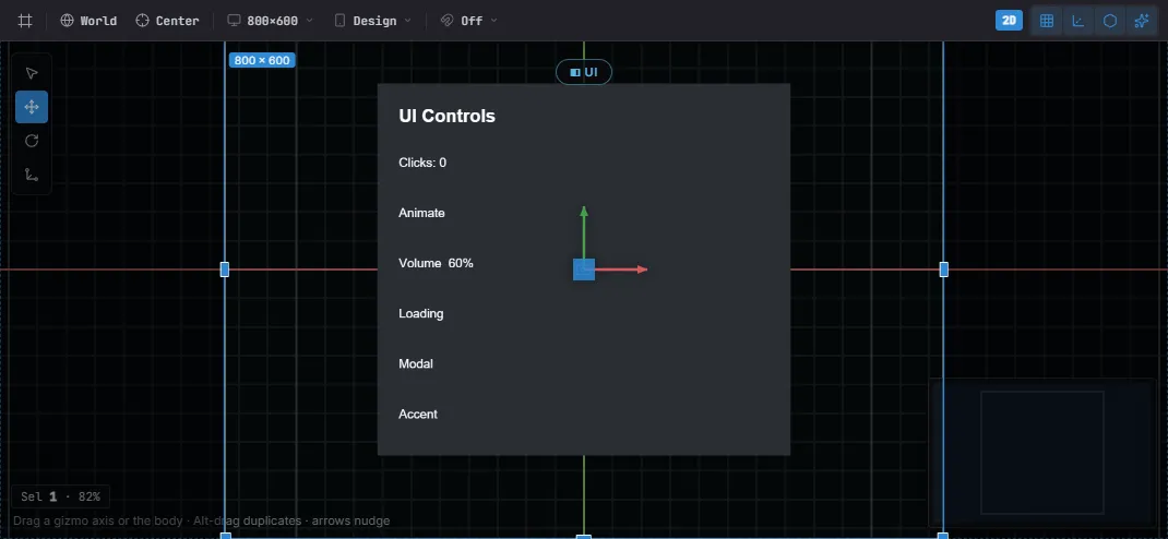
A UI Canvas in the editor — laid out against the design frame, with the selected node’s gizmo. The same widgets author from code or the editor.
Both author the same components — there is no separate editor format:
- Editor — Create… → UI drops widget prefabs (Button, Toggle, Slider, Dialog, …); nest by dragging, edit every field in Details, place with the per-axis anchor picker, and preview against the project’s design resolution and device presets. See The Editor.
- Code —
spawnUIEntity+ the widget factories, from a startup system as above. Anything the editor writes, code can write too.
Where to go next
Section titled “Where to go next”| You want to… | Open |
|---|---|
Size and place boxes — px/percent/auto, flexbox, absolute insets, anchors |
UI Layout |
| Draw text — fonts, SDF/bitmap crispness, wrapping, rich text | UI Text |
React to pointer & keyboard — clicks, UIEvents, drag & drop, focus |
UI Interaction |
| Use ready-made controls — button, toggle, slider, dialog, dropdown, input | UI Components |
| Show scrolling data — virtualized lists and grids | UI Lists |
| Skin everything — design tokens, project theme, live switching | UI Theme |
Keep UI in sync with game state — signals, bind, two-way widget binding |
UI Binding |
| Share state across elements — tabs, radio groups, page-driven visuals | UI Controllers |
Best practices
Section titled “Best practices”- Flex, not absolute — lay out with
FlexContainer+flexGrow; reserveAbsoluteinsets for overlays and badges. - Size with
percent/autofor resolution independence; hardpxonly where a fixed size is intended. - Drive logic from
UIInteractionorUIEvents, never by mutating them. - Reuse the widget factories for consistent state visuals instead of wiring hover/press by hand.
- 9-slice panels (
NineSlice) keep borders crisp at any size.
See also
Section titled “See also”- Input — raw keyboard/mouse/touch below the UI layer.
- Localization — bind
Text.contentto translated keys. - Animation — tween UI color/position for juice.
- The Editor — visual authoring, prefabs, anchor picker.