
Viewport & editing modes
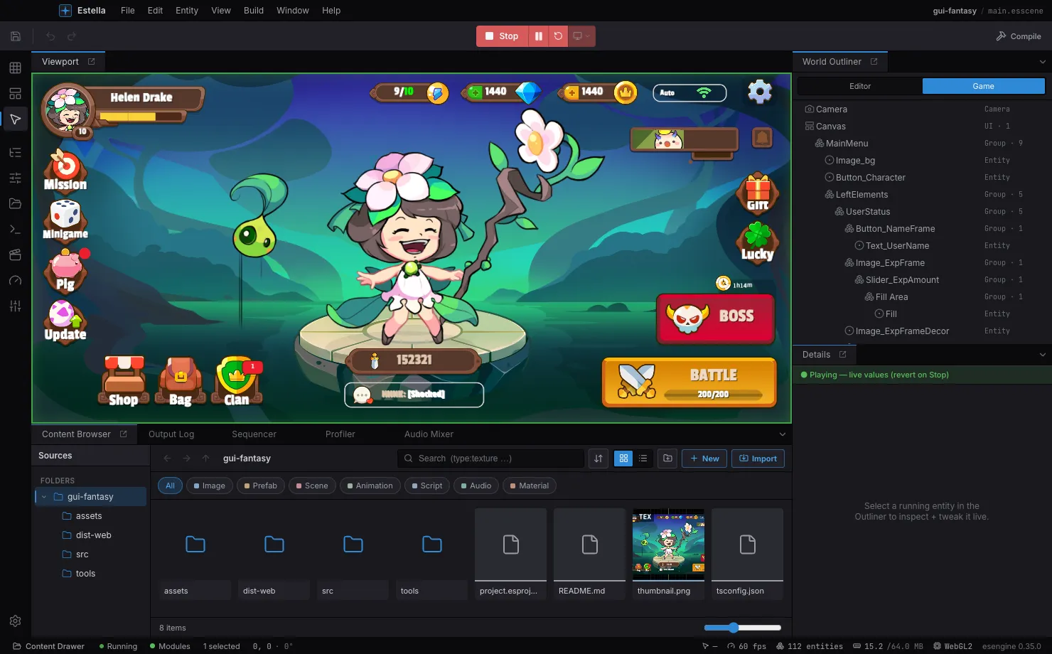
The viewport is where you place and manipulate entities.
Navigation
- Pan — drag with the middle mouse button (or hold Space and drag, for a trackpad).
- Turn — drag with the right mouse button once the view is a spatial one (perspective, or already turned), or Alt-drag from any view. A drag grabs the scene: the world turns the way the pointer moves. On a flat 2D view right-drag pans, as it always did — there is nothing to walk around.
- Zoom — scroll the mouse wheel (zooms toward the cursor).
- Frame Selected — press F to center and fit the selection.
Selecting
- Click an entity to select it; Shift-click to toggle it in a multi-selection.
- Drag on empty space to marquee box-select everything inside.
- Press Esc to cancel an in-progress drag, then to clear the selection.
Transforming — pick a tool from the toolbar (or its shortcut) and drag a gizmo handle:
| Tool | Shortcut | Gizmo |
|---|---|---|
| Select | Q |
Pick / marquee only, no transform handles. |
| Move | W |
Axis arrows (X / Y) plus a center plane for free move. |
| Rotate | E |
A rotation ring. |
| Scale | R |
Axis boxes plus a uniform-scale center. |
Dragging a handle transforms the whole selection as one, about a shared pivot, and each drag is a single undo step. Alt-drag a selection to duplicate it and drag the copies. Nudge the selection with the arrow keys (one grid step; hold Shift for ×10).
Align & distribute — select two or more entities and a strip of alignment buttons appears in the viewport overlay: align left / centre / right edges and top / middle / bottom edges. With three or more selected, two distribute buttons even out horizontal or vertical spacing. Each is a single undo step and works across every entity kind (sprites, UI nodes, gizmo-only entities alike).
Snapping — toggle snapping from the viewport’s Snap dropdown and set the grid step, rotation angle, and scale increment.
Show Flags — a viewport dropdown toggles the Grid, Gizmos, Physics, and the perf
overlay, plus World/Local axis orientation and Pivot-vs-Center. Entities that don’t
render — Cameras, Light, colliders, joints, particle emitters — are drawn as
gizmos in edit mode (icon, view rect, light reach/cone, collider outline, joint
anchor links) so you can see and place them; many carry drag handles that write
their fields directly (light radius, collider size, emitter shape, joint anchors).
Editing modes
Section titled “Editing modes”The Activity Bar’s top three icons switch the editing mode — Scene, UI, or
Tilemap. The mode also follows your selection: pick a Canvas or UINode and the
editor suggests UI mode, a TilemapLayer suggests Tilemap — switching that mode’s
tools and viewport aids without disturbing your panel layout. To open a mode’s
companion panels (UI Widgets, the Tilemap painter), click its Activity Bar icon or the
viewport’s mode chip; that also pins the mode as a sticky lock that ordinary selection
clicks won’t clear — re-click it to go back to following the selection.
The design frame + device preview. A scene is authored against a design resolution —
a fixed reference size (e.g. 1920 × 1080 landscape or 750 × 1334 portrait). This is a
project-level value (Project Settings → Display), not a UI-layer one: the viewport’s
Design and Device controls work in every editor mode (Scene / UI / Tilemap), so
you can preview a gameplay-only scene on a real device without a UI Canvas. When the
scene has a Canvas, UI additionally lays out inside the frame per its scale mode.
- Design dropdown (viewport toolbar) — sets the design resolution and reframes to it (undoable). With a Canvas it edits that Canvas; otherwise it edits the project value.
- Device dropdown — picks the target screen (iPhone / iPad / 1080p …) in any mode. While editing it draws that screen’s aspect as letterbox bars + safe-area insets over your scene; when you press Play the running game is letterboxed to the same shape, in the viewport and in the Game panel alike. It never changes your design resolution — it changes what you are looking at it through.
- Orientation (same dropdown) — swaps the device’s width and height. It applies to a
device, so it is disabled while
Designis selected: with no screen simulated there is nothing to rotate. - Camera Fit (Project Settings → Display) — how the main camera scales the design
resolution, independent of any UI Canvas.
None(default) keeps the camera’s own orthoSize; any other mode letterboxes the game the same way on every device, and the device preview then shows the real framing (WYSIWYG for gameplay, not just UI).
One screen, edit and run. The Design entry is the “no simulation” choice: the game
fills whatever space the panel has, which is what authoring for desktop wants. Pick any
real device and both the edit overlay and the running game commit to its shape — so a
project authored for a phone is never only ever run at whatever aspect the dock
happened to be dragged to.
Project screen presets
Section titled “Project screen presets”The built-in device list is a guess. A team that ships to specific hardware corrects it in Project Settings → Display → Screen presets: add a row with an id, a name and the portrait size, and it joins the dropdown for everyone who opens the project.
- Id is what a saved selection resolves through, so keep it stable. Reusing a built-in
id (
iphone,ipad,1080p,720p) replaces that built-in rather than sitting beside it — which is how a studio makes “iPhone” mean the exact handset it tests on. - Sizes are stored portrait (width ≤ height), like the built-ins, so the orientation toggle means the same thing for every screen.
- Safe area (the row’s ▸ expander) sets the notch / home-indicator insets in device pixels. Leave them at zero and nothing is written to the project file — the viewport’s Safe area overlay then has nothing to draw for that screen.
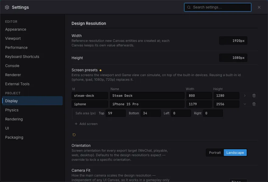
Presets live in project.esproject, so they are shared through version control:
{ "screenPresets": [ { "id": "steam-deck", "label": "Steam Deck", "width": 800, "height": 1280 }, { "id": "iphone", "label": "iPhone 15 Pro", "width": 1179, "height": 2556, "safe": { "top": 59, "bottom": 34, "left": 0, "right": 0 } } ]}