
Text
The Text component draws strings from a dynamic glyph atlas. Give the entity a
UINode and the text lays out inside the flexbox box (wrapped, aligned, sorted
with sibling UI); without a box it renders as a free world-space label anchored
to the entity origin. Spawn one in code with spawnUIEntity({ text: … }) or add
Text in the inspector.
import { defineSystem, addStartupSystem, GetWorld, spawnUIEntity, TextAlign, px } from 'esengine';
const buildHud = defineSystem([GetWorld()], (world) => {  spawnUIEntity({    world,    node: { width: px(240), height: px(40) },    text: { content: 'Score: 0', fontSize: 24, align: TextAlign.Left },  });});addStartupSystem(buildHud);
The two glyph pipelines
Section titled “The two glyph pipelines”Every glyph is rasterized once into a shared atlas and drawn as textured quads.
renderMode picks how it is rasterized, per Text:
Bitmap— glyphs rasterize with Canvas2D at the effective on-screen pixel size: device pixels × the canvas design-resolution fit are folded into rasterization, so quads blit 1:1 with native antialiasing and font hinting. DOM-crisp at any window size — the sharpest choice for static UI.Sdf— each glyph rasterizes once into a signed-distance field and the shader lays a ~1px screen-space coverage ramp on the edge (the msdfgen/TextMeshPro technique). The edge stays crisp under dynamic scaling — animated zoom, scale tweens, world-space labels — where a bitmap would blur or shimmer.Auto(default) — bitmap while the entity’s own world scale is 1 (within ±2%; the canvas fit is already compensated in the bitmap path), SDF the moment the entity scales. DOM-crisp static UI and zoom-stable animated text with no configuration.
So a pulsing “LEVEL UP!” banner needs nothing special — Auto switches it to
SDF while it scales:
import {  defineSystem, Query, Mut, Res, Time, Transform, Text,} from 'esengine';
// Tween the banner's scale; Auto routes the text to the SDF pipeline// while scale ≠ 1, so the glyph edges stay crisp mid-zoom.const pulseBanner = defineSystem([Query(Mut(Transform), Text), Res(Time)], (q, time) => {  for (const [, tr] of q) {    const s = 1 + 0.25 * Math.sin(time.elapsed * 4);    tr.scale.x = s;    tr.scale.y = s;  }});
Force Sdf when text is born scaled or lives in world space at arbitrary
camera zoom; force Bitmap when you know the text never scales and want
hinting even under tiny per-frame scale noise.
Text properties
Section titled “Text properties”Defaults below are the component defaults (what the inspector shows).
| Property | Type | Default | Description |
|---|---|---|---|
content |
string | '' |
The string to display. \n hard-breaks lines. |
i18nKey |
string | '' |
Localization key. Non-empty ⇒ content becomes derived: resolved from the Localization catalogs every frame (see below). |
fontFamily |
string | 'Arial' |
Font family, resolved by the platform’s Canvas2D (see Custom fonts). |
fontSize |
number | 24 |
Size in design px — the same units as UINode px() sizes. The design-resolution fit and device pixel ratio are compensated at rasterization. |
color |
Color | {1,1,1,1} |
Fill color (per-channel 0..1). |
align |
TextAlign |
Left |
Horizontal alignment: Left / Center / Right. |
verticalAlign |
TextVerticalAlign |
Top |
Vertical alignment: Top / Middle / Bottom. |
wordWrap |
boolean | true |
Wrap lines at the box width (needs a UINode box). |
overflow |
TextOverflow |
Visible |
Visible / Clip / Ellipsis. Currently the renderer always draws Visible; clip overflow with a UIMask on the box. |
lineHeight |
number | 1.2 |
Line spacing as a ratio of fontSize (baseline-to-baseline = lineHeight × fontSize). |
bold / italic |
boolean | false |
Base font style (rich-text <b>/<i> layer on top). |
strokeColor |
Color | {0,0,0,1} |
Outline color. |
strokeWidth |
number | 0 |
Outline width in px; 0 disables. On an SDF atlas the glyph’s own edge is pushed outward, so it stays the glyph’s shape at any width (see below). |
shadowColor |
Color | {0,0,0,1} |
Drop-shadow color. |
shadowOffsetX / shadowOffsetY |
number | 0 |
Shadow offset in px. |
shadowBlur |
number | 0 |
Softens the shadow, in px. 0 is a hard offset copy; above that the shadow spreads into a ring, so it reads as a soft mass under the glyphs rather than a second stamp of them. A blur with no offset is a halo. |
richText |
boolean | false |
Parse inline rich-text markup. |
renderMode |
TextRenderMode |
Auto |
Glyph pipeline: Auto / Bitmap / Sdf (see above). |
enabled |
boolean | true |
Render toggle (the editor’s eye icon uses it too). |
Alignment — with and without a box
Section titled “Alignment — with and without a box”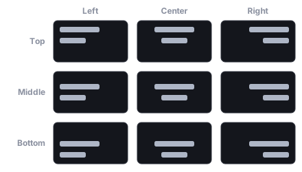
align (Left / Center / Right) and verticalAlign (Top / Middle / Bottom) place the text block within its box — the nine combinations.
One rule covers both cases: align / verticalAlign position the text block
within its box, and a missing box collapses to a zero-size box at the entity
origin — so the same fields anchor a free label instead of silently doing
nothing.
- With a
UINodebox (the entity has aUINodewith a non-zero laid-out size): each line aligns horizontally within the box width — independent ofwordWrap, which only decides whether lines break at that width — andverticalAligndistributes the block’s vertical slack (Middlesplits it,Bottompushes the block down). - Without a box (no
UINode, or a 0×0 one): the block anchors to the entity origin.align: Leftputs the left edge at the origin,Centercenters the block on it,Rightends at it;verticalAlignanchors top/middle/bottom edge the same way. This is what you want for world-space labels — damage numbers, nameplates — where “center on the entity” is one field, not math.
Outlines
Section titled “Outlines”strokeWidth + strokeColor outline the glyphs, shadow* drops a shadow behind
them. Both are drawn from the same atlas as the fill, so a styled label still
batches with an unstyled one.
An outline moves the glyph’s edge — it is not a fan of copies. SDF glyphs
carry a distance to their own edge, so the outline is that edge pushed outward:
the same quads draw the same shape, grown. The width you ask for is converted
through the atlas’s spread and render size, so it means the same thing at every
fontSize and every camera zoom, and asking for more than the atlas can dilate
degrades to the widest real outline instead of flooding the glyph’s cell.
Bitmap glyphs have no distance to push, so they keep the old eight-direction
stamp of the glyph. That reads as an outline while it is a hairline and merges
into a blob past a few pixels — force renderMode: Sdf
for anything thicker than about a pixel.
A shadowBlur above 0 stamps the shadow at the centre plus a ring of eight
around it, with each tap’s alpha inverted out of the compositing equation so the
stack lands at the alpha you asked for. Unlike the outline it softens the edge
rather than moving it, which is why the two are separate fields.
Rich text
Section titled “Rich text”Set richText: true and mark up content with inline tags. Styles nest as a
stack; a closing tag pops the innermost style. Anything that does not parse as a
known tag renders literally (so a stray < cannot eat your text).
| Markup | Effect |
|---|---|
<b>…</b> |
Bold run. |
<i>…</i> |
Italic run. |
<color=#RRGGBB>…</color> |
Colored run; #RRGGBBAA adds alpha. |
<font size=32>…</font> |
Run at another font size (size="32" also parses); the shared baseline is kept. |
<img src="…" width=24 height=24 /> |
Inline image — an icon flowed in with the text (see below). |
import { defineSystem, addStartupSystem, GetWorld, spawnUIEntity, px } from 'esengine';
const buildToast = defineSystem([GetWorld()], (world) => {  spawnUIEntity({    world,    node: { width: px(360), height: px(48) },    text: {      content: 'Found <color=#ffd75a><b>Iron Sword</b></color> <font size=12>(rare)</font>',      fontSize: 18,      richText: true,    },  });});addStartupSystem(buildToast);
The parser is exported as parseRichText(input), returning RichTextRun[] — a
TextSegment (text, bold, italic, color, fontSize) or ImageSegment
per run — if you want to drive a custom pipeline from the same markup.
Inline images
Section titled “Inline images”<img src="…" width=N height=N valign=baseline|middle|top|bottom offsetX=N offsetY=N scale=N tint=#RRGGBB /> (self-closing, src required) flows an image
inline with the text. The same rich-text layout that places the glyphs places
the image box — valign anchors it on the line, width/height/scale size
it, offsetX/Y nudge it, tint recolors it — and it renders as a child image
quad under the Text. src resolves through Assets.loadTexture, so it is a
project-relative texture path.
Measuring text
Section titled “Measuring text”measureText(text, opts) answers “how big will this string render?” without
spawning an entity — for layout that must size to content up front, e.g. a
ListView itemHeight(index) for wrapped chat bubbles. It measures through the
same Canvas2D source and the same wrap algorithm the renderer uses, so measured
wraps match rendered ones. On a headless host (no DOM) it falls back to an
average-glyph estimate.
import { measureText, px, spawnUIEntity, defineSystem, addStartupSystem, GetWorld } from 'esengine';
const buildBubble = defineSystem([GetWorld()], (world) => {  const message = 'You have been invited to join the guild "Night Watch".';  const m = measureText(message, { fontSize: 16, maxWidth: 260 });  spawnUIEntity({    world,    node: { width: px(280), height: px(m.height + 20) }, // pad the measured height    visual: { color: { r: 0.13, g: 0.15, b: 0.2, a: 1 } },    text: { content: message, fontSize: 16, wordWrap: true },  });});addStartupSystem(buildBubble);
MeasureTextOptions |
Default | Description |
|---|---|---|
fontSize |
— (required) | Size in display px. |
fontFamily |
'Arial' |
Font family. |
bold / italic |
false |
Style (affects advances). |
letterSpacing |
0 |
Extra px between glyphs. |
maxWidth |
— | Word-wrap width; 0/omitted = single line. |
lineHeight |
fontSize × 1.2 |
Line height in display px (note: px, not the component’s ratio). |
TextMetrics |
Description |
|---|---|
width |
Width of the widest line, display px. |
lineCount |
Lines after wrapping plus explicit \n. |
height |
lineCount × lineHeight — the height to size a box to. |
Custom fonts
Section titled “Custom fonts”There are two ways to say which typeface, and they end in the same place — a family name the platform’s text stack rasterizes with.
Ship the font with the game (Text.font). Import a .ttf / .otf / .woff2 into
the project and assign it to the font slot in the inspector. It is a real asset
reference, so it rides the machinery every other asset slot rides: dependency tracking,
cook inclusion, @uuid: refs, hot update, ref counting. The loader registers the file
with the platform’s text stack under a family name it mints, and Text uses that name —
so a shipped font is not a second text path, just another way to arrive at a family. This
is the answer on native, where there is no page to load a web font into.
Name a font the host already has (fontFamily). Resolved by the platform’s
Canvas2D on the web (or the OS font matcher on native) when glyphs rasterize — system
fonts, or a web font the page loads itself (CSS @font-face or the FontFace API). The
SDK does not fetch these; make sure a web font is loaded before the text first renders,
or its glyphs rasterize with the fallback font.
font wins when both are set. Prefer it for anything your brand depends on: fontFamily
alone silently falls back to a different typeface on a machine that lacks the family, and
that failure only shows up on someone else’s device.
Separately, bitmap font assets (.fnt / .bmfont) load through the asset
pipeline — Assets.loadFont(ref) resolves the .fnt, loads its page texture,
and returns a FontResult ({ handle }). They drive the BitmapText
component: a world-space text renderer whose font field references the loaded
asset (assign the font asset in the inspector), with text, color,
fontSize, align, spacing, parallax, and layer fields. Use BitmapText
for pre-baked score/damage glyph art; use Text for UI.
Localization
Section titled “Localization”Set i18nKey instead of hand-writing content: while a Localization resource
exists (install localizationPlugin), a per-frame system resolves the key
through the catalogs and writes the result into content — so setLocale
re-flows every bound label on the next frame. A missing key resolves to the key
itself (visible and greppable), and with no Localization resource the authored
content stands. See Localization.
Best practices
Section titled “Best practices”- Leave
renderModeonAuto— hand-pickSdfonly for text that is born scaled,Bitmaponly to pin hinting on text you know never scales. - Give UI text a
UINodebox so wrapping and alignment have a width to work against; go boxless only for world-space labels anchored to an entity. fontSizeis design px — size text in the same units as yourpx()layout and let the engine handle DPR and the design-resolution fit.- Measure before you size —
measureTextuses the renderer’s own wrap, so content-sized boxes (chat rows, tooltips) come out exact. - Bind labels with
i18nKey, not by writing translated strings intocontent— locale switches then re-flow for free. - Prefer markup over entity-splitting for emphasis: one rich Text beats three plain ones glued with flexbox.
See also
Section titled “See also”- UI — the component model overview.
- UI Layout — the
UINodebox that text aligns and wraps within. - UI Components —
createTextInputfor editable text. - UI Theme — themed text color roles and type scale.
- UI Binding — drive
contentfrom reactive signals. - Localization — catalogs, locales, and
i18nKeyresolution.