
Screen & Design Resolution
You author a game against one design resolution (1920×1080 by default) and the
engine fits that box onto whatever screen the game actually runs on. This page is
the complete reference for that pipeline: the units model, the Canvas component,
every scale mode with worked numbers, the project-level ScreenScaling fit, why UI
pixels are stable, reacting to resizes and orientation, device safe areas, and the
pixelPerfect camera flag.
World units are design pixels
Section titled “World units are design pixels”Estella’s 2D units model is deliberately simple:
- 1 world unit = 1 design pixel. A 100×200 texture spawns a 100×200 sprite; a
UINodesizedpx(300)is 300 design pixels wide. - The default scene camera’s
orthoSizeisdesignResolution.y / 2= 540 — half the design height — so at the design aspect the camera shows exactly one design box (1920×1080 world units). - The world is Y-up; screen coordinates are Y-down (converted for you by
CameraView). Canvas.pixelsPerUnit(default100) is the physics scale — world pixels per Box2D meter — not a display scale. Rendering never divides by it.
When the actual screen has a different aspect than the design resolution, a scale mode decides how the design box is fitted — that scales the visible box, never your content: sprites keep their pixel sizes, positions stay put.
The Canvas component
Section titled “The Canvas component”One entity per scene carries a Canvas — the declaration of the design resolution
and how it adapts. The editor seeds it when you create a scene; the first Canvas
found is the one the engine uses.
| Property | Type | Default | Description |
|---|---|---|---|
designResolution |
Vec2 | {x: 1920, y: 1080} |
Design (reference) resolution in pixels — the box you author against. |
pixelsPerUnit |
number | 100 |
World pixels per physics meter (Box2D + tile-collider scale). Min 1. Not a display scale. |
scaleMode |
ScaleMode |
FixedHeight |
How the design resolution adapts to the actual screen aspect (see below). |
matchWidthOrHeight |
number | 0.5 |
Match-mode blend, 0–1: 0 = fit width, 1 = fit height. Ignored by the other modes. |
backgroundColor |
Color | {r:0, g:0, b:0, a:1} |
Background color declared for the letterbox/pillarbox areas outside the design box. |
import { defineSystem, GetWorld, Canvas } from 'esengine';
const readCanvas = defineSystem([GetWorld()], (world) => {  const [canvasEntity] = world.getEntitiesWithComponents([Canvas]);  if (canvasEntity === undefined) return;
const canvas = world.get(canvasEntity, Canvas); const designW = canvas.designResolution.x; // 1920 const designH = canvas.designResolution.y; // 1080});Scale modes
Section titled “Scale modes”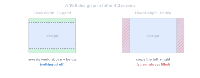
The fit math is one pure function, exported as computeEffectiveOrthoSize. Given
the design box and the actual screen aspect it produces the effective ortho
half-height — half the height of the world box the camera will show, in world
units (design pixels). Two candidate answers exist:
orthoForWidth = (designResolution.y / 2) × designAspect / actualAspect— the half-height at which the design width exactly spans the screen.orthoForHeight = designResolution.y / 2— the half-height at which the design height exactly spans the screen.
Each ScaleMode picks between them:
ScaleMode |
Value | Effective half-height | Behavior |
|---|---|---|---|
FixedWidth |
0 |
orthoForWidth |
The design width always spans the screen exactly. Taller screens reveal extra world above/below; wider screens crop the top/bottom. |
FixedHeight |
1 (default) |
orthoForHeight |
The design height always spans the screen exactly. Wider screens reveal extra world at the sides; narrower screens crop the sides. |
Expand |
2 |
max(orthoForWidth, orthoForHeight) |
The whole design box is always visible; the shorter-fit axis reveals extra world beyond it. Safe: nothing designed is ever cut off. |
Shrink |
3 |
min(orthoForWidth, orthoForHeight) |
The screen is always filled by the design box; the overflowing axis is cropped. Nothing outside the design box is ever revealed. |
Match |
4 |
orthoForWidth^(1−t) × orthoForHeight^t |
Geometric blend by matchWidthOrHeight (t): 0 behaves like FixedWidth, 1 like FixedHeight, 0.5 splits the difference. |
Two Cocos-style aliases exist on the ScaleMode object (they are the same
values, not extra modes): ScaleMode.ShowAll === ScaleMode.Expand and
ScaleMode.NoBorder === ScaleMode.Shrink.
import { computeEffectiveOrthoSize, ScaleMode } from 'esengine';
const halfH = computeEffectiveOrthoSize(  540,          // baseOrthoSize = designResolution.y / 2  1920 / 1080,  // design aspect (≈ 1.778)  1024 / 768,   // actual screen aspect (4:3 ≈ 1.333)  ScaleMode.Expand,  0.5,          // matchWidthOrHeight (Match mode only));// halfH === 720 → the camera shows 1920 × 1440 design pixels
Worked example — 1920×1080 design on a 4:3 screen
Section titled “Worked example — 1920×1080 design on a 4:3 screen”On a 1024×768 (4:3) screen, orthoForWidth = 540 × (16/9)/(4/3) = 720 and
orthoForHeight = 540:
| Mode | Half-height | Visible world box (design px) | Consequence |
|---|---|---|---|
FixedWidth |
720 |
1920 × 1440 | Full design width; 180 extra world px revealed above and below. |
FixedHeight |
540 |
1440 × 1080 | Full design height; 240 design px cut off on each side. |
Expand / ShowAll |
720 |
1920 × 1440 | Whole design box visible; extra world above/below (same as FixedWidth here — on a wider screen it instead matches FixedHeight). |
Shrink / NoBorder |
540 |
1440 × 1080 | Screen filled, nothing beyond the design box revealed; sides cropped. |
Match (t = 0.5) |
≈ 623.5 |
≈ 1663 × 1247 | Halfway: mild crop at the sides and mild reveal above/below. |
How the camera relates
Section titled “How the camera relates”The fit does not run against the camera’s authored orthoSize — it runs against
designResolution.y / 2. Each frame the camera plugin resolves a fit source
in this order:
ScreenScaling(the project-level fit, below) when itsscaleModeis a real mode (≥ 0) — authoritative, works with no UI at all;- else the scene’s
Canvascomponent, if one exists; - else no fit — the camera renders its raw
orthoSize.
The camera fit and the UI layout box resolve through this same order, so
there is one design resolution in play at a time — a scene whose Canvas still
carries an older resolution than the project fit cannot lay UI out one way in the
editor and another in the shipped build.
The default scene camera is authored with orthoSize: 540 = designResolution.y / 2
precisely so the unfitted and fitted views agree at the design aspect: whether the
fit is on or off, a 1920×1080 window shows exactly one design box.
Project-wide fit: the ScreenScaling resource
Section titled “Project-wide fit: the ScreenScaling resource”ScreenScaling makes the design-resolution fit a project concern instead of a UI
one — a scene with no Canvas (no UI) still letterboxes correctly. It is the
runtime image of Settings → Project → Game → Display → Camera fit.
| Field | Type | Default | Description |
|---|---|---|---|
designWidth |
number | 1920 |
Design (reference) resolution width in px. |
designHeight |
number | 1080 |
Design (reference) resolution height in px. |
scaleMode |
number | SCREEN_FIT_OFF (-1) |
A real ScaleMode (0–4) turns the project fit on; SCREEN_FIT_OFF keeps the legacy behavior (Canvas fit when present, else raw orthoSize). |
matchWidthOrHeight |
number | 0.5 |
Match-mode blend 0–1 (0 = fit width, 1 = fit height); ignored by other modes. |
DEFAULT_SCREEN_SCALING is that off-by-default value, and SCREEN_FIT_OFF (-1)
is the sentinel. When the project fit is on it is authoritative — for the
camera and for the UI layout box alike, since both resolve the fit the same way.
The shipped runtimes install it from the project config (createWebApp’s
screenFit option). Game code can read or override it live — the camera plugin
re-reads it every frame:
import { defineSystem, Res, ScreenScaling, ScaleMode } from 'esengine';
const enableProjectFit = defineSystem([Res(ScreenScaling)], (fit) => {  fit.designWidth = 1280;  fit.designHeight = 720;  fit.scaleMode = ScaleMode.Expand;   // any real mode (≥ 0) switches the fit on});
UI layout: UINode pixels are design pixels
Section titled “UI layout: UINode pixels are design pixels”UI is laid out inside a world-space rectangle (uiLayoutRect), and for scene
cameras that rectangle is the fitted camera extents. Because world units are
design pixels, px(300) on a UINode is 300 design pixels on every device — the
scale mode changes how much world is visible around the UI, never the UI’s own
proportions.
The editor viewport is the special case: its navigation camera renders the
world at a free zoom (raw orthoSize, no fit — so panning/zooming stays
predictable). If UI were laid out against those zoomed extents, every element
would rescale and reflow on each scroll-wheel tick. Instead the editor recovers
the fixed design-resolution box from the fit and lays UI out there — so the
layout is identical at any zoom, and the UI still scales visually with the scene
because it renders through the same zoomed view. The device simulator passes a
preview aspect into the same math, which is why the letterboxed preview is exactly
what ships.
Both pure functions — uiLayoutRect and computeEffectiveOrthoSize — are
exported for tools and tests.
Where the box sits: screen roots vs world-space UI
Section titled “Where the box sits: screen roots vs world-space UI”The box has a size (the area UI lays out in) and a place (where that area sits in the world). The place is what decides whether a HUD travels with the camera:
- A UI root with no parent entity is a screen root: the engine places it at
the box’s center every frame. In play that center is the camera, so the HUD
stays on screen no matter how far the camera scrolls. In the editor the box is
anchored at the world origin (
EDITOR_UI_ANCHOR), which is exactly where the design-frame overlay is drawn — pan and zoom move UI like any other content. - A UI root parented to an entity is world-space UI: it rides its parent’s transform (a health bar over a unit, a panel on a wall) and the box only sizes it.
So “make this HUD follow the camera” needs nothing — that is the default. To pin UI into the world instead, give its root a parent.
Which cameras see it: Camera.cullingMask
Section titled “Which cameras see it: Camera.cullingMask”Every drawable belongs to one sorting layer, and a camera renders a set of them.
Camera.cullingMask is that set as a bitmask — bit i = layer i, all bits set by
default, so a camera you never configure draws everything exactly as before.
UI belongs to a layer too, but not through the field that orders it: a UI draw’s
layer is its position in the tree (1000 + tree order), which is why a mask over
layers 0–31 could not address it. Its membership comes from Canvas.layer
instead — a normal sorting layer that changes nothing about draw order and exists
only so cameras can include or exclude that canvas’ UI.
That is what makes a minimap possible: put the HUD’s Canvas on its own layer and
clear that bit on the minimap camera.
import { defineSystem, GetWorld, Camera, Canvas } from 'esengine';
const UI_LAYER = 1;
const setupMinimap = defineSystem([GetWorld()], (world) => {  // The HUD declares which layer it is part of...  world.set(hudCanvas, Canvas, { ...world.get(hudCanvas, Canvas), layer: UI_LAYER });  // ...and the minimap says it does not draw that layer.  const cam = world.get(minimapCamera, Camera);  world.set(minimapCamera, Camera, { ...cam, cullingMask: cam.cullingMask & ~(1 << UI_LAYER) });});
In the editor the mask is a multi-select of your project’s sorting layer names (Settings → Project → Rendering → Layer names). The editor’s own viewport ignores it and always shows every layer, so culling never hides content while you author.
Screen size & orientation: ScreenInfo
Section titled “Screen size & orientation: ScreenInfo”ScreenInfo is a small helper class (not auto-installed by the runtimes): you
construct it, feed it sizes, and it derives orientation and fires callbacks.
| Member | Type | Default | Description |
|---|---|---|---|
width |
number | 0 |
Last reported screen width in px. |
height |
number | 0 |
Last reported screen height in px. |
dpr |
number | 1 |
Device pixel ratio. |
orientation |
ScreenOrientation |
Portrait |
Landscape when width > height, else Portrait. |
on(event, fn) |
method | — | Subscribe to 'resize' (every update()) or 'orientationchange' (when the derived orientation flips; never on the first update()). Returns an unsubscribe function. |
update(width, height, dpr = 1) |
method | — | Feed the current size; recomputes orientation and fires the listeners. |
import { ScreenInfo, ScreenOrientation } from 'esengine';
const screen = new ScreenInfo();screen.on('resize', (w, h) => { /* re-position off-canvas HUD, etc. */ });screen.on('orientationchange', (o) => {  if (o === ScreenOrientation.Portrait) { /* show the "rotate device" hint */ }});
const feed = () =>  screen.update(window.innerWidth, window.innerHeight, window.devicePixelRatio);window.addEventListener('resize', feed);feed();
The shipped orientation is a project setting, not runtime state: Project
Settings → Display → Orientation writes one value that every export target
consumes (the WeChat game.json, the web/playable rotate hint, the desktop window
aspect). When unset, it is derived from the design resolution’s aspect.
Safe areas (notches & rounded corners)
Section titled “Safe areas (notches & rounded corners)”Add a SafeArea component to an absolute UINode and the engine keeps that
node inside the device’s safe area by writing its four insets every time the
insets or screen change. The system ships as part of the standard UI plugin
(safeAreaPlugin, built by uiPlugin) — nothing to install in a normal app.
| Property | Type | Default | Description |
|---|---|---|---|
applyTop |
boolean | true |
Push the node’s top inset down by the top safe-area inset. |
applyBottom |
boolean | true |
Same for the bottom inset. |
applyLeft |
boolean | true |
Same for the left inset. |
applyRight |
boolean | true |
Same for the right inset. |
Platform insets are converted from device pixels into UI design pixels before being written, so the layout stays resolution-independent:
- WeChat: read from
wx.getSystemInfoSync().safeAreaautomatically. - Web: read from the
--sat/--sab/--sal/--sarCSS custom properties on the root element — define them fromenv(safe-area-inset-*)in your host page to opt in (they read as0otherwise).
import {  defineSystem, GetWorld, spawnUIEntity, SafeArea, UIPositionType,} from 'esengine';
const buildHudRoot = defineSystem([GetWorld()], (world) => {  // Absolute node; leave width/height auto — the SafeArea system writes the four  // insets, so the node stretches to exactly the safe region.  const hudRoot = spawnUIEntity({    world,    node: { position: UIPositionType.Absolute },  });  world.insert(hudRoot, SafeArea, {    applyTop: true, applyBottom: true, applyLeft: true, applyRight: true,  });  // Parent all HUD widgets under hudRoot — they stay clear of the notch.});
Pixel-perfect rendering
Section titled “Pixel-perfect rendering”Camera.pixelPerfect (default false) snaps the camera’s position onto the
world-space pixel grid before the view matrix is built, so static pixel art
lands on the same texels every frame instead of shimmering as the camera drifts by
sub-pixel amounts. Facts from the implementation:
- Orthographic cameras only (a perspective pixel grid is ill-defined).
- One grid cell = one rendered pixel:
worldPerPixel = 2 × halfHeight / viewportHeightInDevicePixels— it adapts to the current fit and window size. - The snapped position also drives screen↔world conversion, so picking stays consistent with what is drawn.
- The editor’s free navigation view never snaps; the flag applies in play/runtime.
Project Display settings → runtime
Section titled “Project Display settings → runtime”Where each Settings → Project → Game → Display field lives and lands:
| Editor setting | Project manifest | Runtime effect |
|---|---|---|
| Design width / height | designResolution.width / .height |
Seeds new scene Canvas components and editor cameras; fills ScreenScaling.designWidth/Height (via createWebApp’s screenFit). |
| Orientation | packaging.orientation ('portrait' | 'landscape'; absent = derived from the design aspect) |
WeChat game.json, web/playable rotate hint, desktop window aspect, editor device preview. |
| Camera fit | features.rendering.cameraScaleMode ('none', 'fixed-width', 'fixed-height', 'expand', 'shrink', 'match'; absent = 'none') |
Mapped to ScreenScaling.scaleMode ('none' → SCREEN_FIT_OFF). |
| Camera fit match | features.rendering.cameraMatch (0–1, default 0.5) |
ScreenScaling.matchWidthOrHeight. |
Separately, two RuntimeConfig knobs set the default scaleMode for newly
created Canvas components (they do not touch canvases already saved in a
scene): RuntimeConfig.canvasScaleMode (default 1 = FixedHeight) and
RuntimeConfig.canvasMatchWidthOrHeight (default 0.5). Build configs set them
by name through applyBuildRuntimeConfig — canonical CanvasScaleMode names plus
the ShowAll / NoBorder aliases; unknown names fall back to FixedHeight:
import { applyBuildRuntimeConfig } from 'esengine';
applyBuildRuntimeConfig(app, {  canvasScaleMode: 'Expand',        // name-based: 'FixedWidth' … 'Match', 'ShowAll', 'NoBorder'  canvasMatchWidthOrHeight: 0.5,});
Best practices
Section titled “Best practices”- Author everything at the design resolution and treat world units as design pixels — never scale content to “fit a screen”; pick a scale mode instead.
Expand(ShowAll) for content that must never be cut off (UI-heavy, puzzle); draw backgrounds that bleed past the design frame.Shrink(NoBorder) for full-bleed art where cropping the edges is acceptable.- Prefer the project fit (
ScreenScalingvia Settings → Project → Game → Display) over relying on the UICanvas— it works in scenes with no UI and keeps camera and UI concerns separate. - Don’t repurpose
pixelsPerUnitas a zoom or display scale; it only scales physics meters. Zoom isorthoSize(when no fit is active) or design-resolution choice. - Anchor HUD roots with
SafeAreaon mobile — one absolute root node withSafeAreaprotects the whole HUD from notches. - Enable
pixelPerfectonly for pixel-art games; it quantizes camera motion, which smooth-scrolling high-res games don’t want.