UI Layout
UI geometry is a CSS box model solved by a single-pass flexbox engine (Yoga) in
the C++ core, every frame, against the camera’s UI box. This page is the deep
reference: units, the Dimension type, every UINode and FlexContainer
field, absolute positioning, anchor presets, and recipes. For the component
model overview start at UI.
Units: design pixels
Section titled “Units: design pixels”Every px in UI layout is a design pixel — a unit of the project’s design
resolution (Project Settings → Display), not a device pixel. Scene cameras bake
the design-resolution fit into their extents, so inside the UI layout box
1 world unit = 1 design px and a px(320) panel is 320 design px wide on
every device; the canvas scale mode decides how that design box fits the real
screen (letterbox, expand, match). The editor’s free-zoom view lays UI out
against the same fixed design box, so zooming the viewport never reflows your
interface. See Screen & Resolution and
Camera.
Dimensions: px, percent, auto
Section titled “Dimensions: px, percent, auto”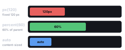
The three length units: px is a fixed design-pixel size, percent is a fraction of the parent’s axis, and auto shrinks to content (or is stretched by the container).
Every length field is a Dimension — { value, unit } — built with three
helpers:
import { px, percent, auto, isAuto, DimensionUnit } from 'esengine';
px(320) // 320 design pixelspercent(50) // 50% of the parent's corresponding axis (0..100, not 0..1)auto() // content-/layout-driven; value is ignoredisAuto(d) // true when d is the auto lengthpx(n)— absolute design pixels (DimensionUnit.Px).percent(n)— percentage of the parent’s corresponding axis: awidth: percent(50)is half the parent’s width,height: percent(50)half its height. The scale is 0–100, mirroring CSS%.auto()— “let layout decide”. What that means depends on the field:
| Field | auto() means |
|---|---|
width / height |
Content-driven (text measure, children) or stretched by the container; a root node fills the camera box on any auto axis. |
minWidth/Height, maxWidth/Height |
No constraint. |
flexBasis |
Use width/height, else content size. |
insetLeft/Top/Right/Bottom |
That edge is unconstrained (see Absolute positioning). |
marginLeft/Top/Right/Bottom |
The margin absorbs free space (CSS margin: auto); on an Absolute node, all-auto margins + insets center the axis. |
UINode — the box
Section titled “UINode — the box”UINode holds the per-item layout fields (container-level fields live on
FlexContainer). Defaults below are the component defaults from the SDK source.
| Property | Type | Default | Description |
|---|---|---|---|
position |
UIPositionType |
Relative |
Relative = in the flex flow; Absolute = out of flow, placed by insets. |
display |
UIDisplay |
Flex |
None removes this node and its whole subtree from layout, rendering, and hit-testing — the hierarchical show/hide. Contrast UIVisual.enabled, which hides only this entity’s visual. |
width / height |
Dimension |
auto() |
Box size; auto = content-/flex-driven. |
minWidth / minHeight |
Dimension |
auto() |
Lower size bounds; auto = unconstrained. |
maxWidth / maxHeight |
Dimension |
auto() |
Upper size bounds; auto = unconstrained. |
flexGrow |
number | 0 |
Share of the container’s free main-axis space to absorb (0 = don’t grow). |
flexShrink |
number | 1 |
Shrink factor when space is tight (0 = never shrink). |
flexBasis |
Dimension |
auto() |
Base main-axis size before grow/shrink; auto = use width/height or content. |
alignSelf |
AlignSelf |
Auto |
Per-item cross-axis override (Auto / Start / Center / End / Stretch); Auto inherits the container’s alignItems. |
marginLeft/Top/Right/Bottom |
Dimension |
px(0) |
Outer spacing; auto() absorbs free space (CSS auto margin). |
insetLeft/Top/Right/Bottom |
Dimension |
auto() |
Offset from the parent’s edges when position is Absolute (CSS left/top/right/bottom); auto = edge unconstrained. |
FlexContainer — laying out children
Section titled “FlexContainer — laying out children”Add a FlexContainer to a node to lay out its children. The mental model is
CSS flexbox — each field maps 1:1 to a CSS property:
| Property | Type | Default | CSS | Description |
|---|---|---|---|---|
direction |
FlexDirection |
Row |
flex-direction |
Row / Column / RowReverse / ColumnReverse — the main axis. |
wrap |
FlexWrap |
NoWrap |
flex-wrap |
NoWrap / Wrap. |
justifyContent |
JustifyContent |
Start |
justify-content |
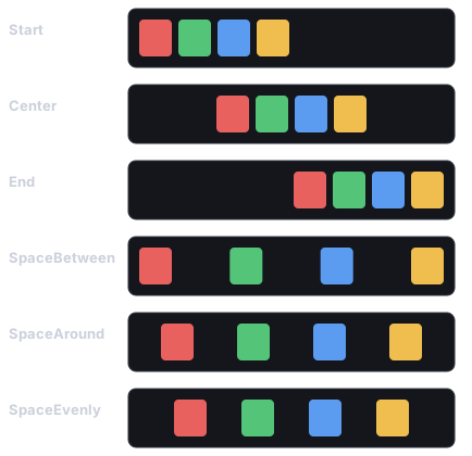
Main-axis distribution: Start / Center / End / SpaceBetween / SpaceAround / SpaceEvenly. |
alignItems |
AlignItems |
Stretch |
align-items |
Cross-axis alignment: Start / Center / End / Stretch. |
alignContent |
AlignContent |
Start |
align-content |
Wrapped-line distribution: Start / Center / End / Stretch / SpaceBetween / SpaceAround. |
gap |
Vec2 |
{x: 0, y: 0} |
column-gap / row-gap |
Space between children, plain design px (x = column gap, y = row gap). |
padding |
Padding |
{0,0,0,0} |
padding |
Inner spacing (left/top/right/bottom), plain design px. |
How flex arranges children
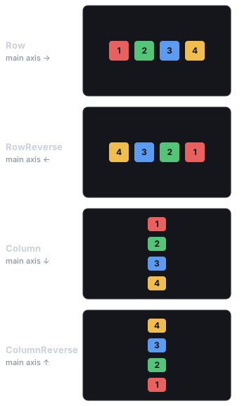
Section titled “How flex arranges children”A flex container lays its children out along a main axis (chosen by direction),
with the cross axis perpendicular to it. justifyContent distributes children
along the main axis, alignItems lines them up across the cross axis, and wrap lets
an over-full line spill onto the next. Every enum value below is exactly its
CSS-flexbox namesake — the engine runs Yoga, so if you know flexbox, you know this.
direction — the main axis, and the order children flow in:
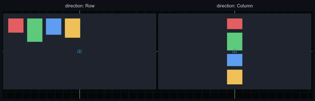
The same four boxes rendered live in the editor — a Row container and a Column one. The diagrams here aren’t an approximation: they’re exactly what the engine draws.
justifyContent — how children pack along the main axis, and how any leftover
space is shared out:
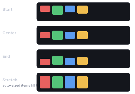
alignItems — how children line up across the cross axis. Stretch (the
default) grows only the items whose cross-size is auto; items with a fixed size keep it:
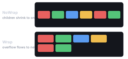
wrap — when the children don’t fit the main axis, NoWrap shrinks them onto one
line (via flexShrink); Wrap keeps their size and flows the overflow onto new lines
(those lines are then distributed by alignContent):
import { FlexContainer, FlexDirection, JustifyContent, AlignItems } from 'esengine';
world.insert(panel, FlexContainer, {  direction: FlexDirection.Column,  justifyContent: JustifyContent.Center,  alignItems: AlignItems.Center,  gap: { x: 0, y: 12 },  padding: { left: 16, top: 16, right: 16, bottom: 16 },});
Absolute positioning
Section titled “Absolute positioning”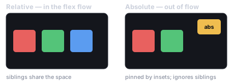
Relative nodes flow in the layout and share the space with their siblings; an Absolute node is lifted out of the flow and pinned by its insets, floating over the rest.
position: Absolute takes a node out of the flex flow; the four insets place
it against the parent’s box, exactly like CSS left/top/right/bottom:
- One edge pinned —
insetTop: px(16), insetRight: px(16)puts the box 16px from the top-right corner; theautoedges stay unconstrained and the authoredwidth/heightapply. - Both edges pinned +
autosize — the insets drive the size:insetLeft: px(0), insetRight: px(0)withwidth: auto()stretches the box across the parent. All four insets atpx(0)= fill the parent (that’s whatspawnUIEntity’snode: { fill: true }writes). - Percent insets resolve against the parent’s corresponding axis, like
every other
Dimension.
Centering with auto
Section titled “Centering with auto”An Absolute node centers an axis when both its insets and both its
margins on that axis are auto — the engine reads that combination as
“center this out-of-flow node in the parent box”. This is a per-node rule the
engine adds on top of Yoga (Yoga’s absolute-position centering keys off the
parent’s justifyContent, so it couldn’t differ per sibling), and it’s the one
anchor a pivot-less CSS box can’t otherwise express. Each axis resolves
independently, so you can center horizontally while pinning the top edge.
import { spawnUIEntity, UIPositionType, px, auto } from 'esengine';
// Dead-center 320×220 panel: insets AND margins all auto on both axes.const panel = spawnUIEntity({  world,  node: {    position: UIPositionType.Absolute,    width: px(320), height: px(220),    marginLeft: auto(), marginRight: auto(),    marginTop: auto(), marginBottom: auto(),  },  visual: { color: { r: 0.08, g: 0.10, b: 0.16, a: 0.95 } },});
Anchor presets in code
Section titled “Anchor presets in code”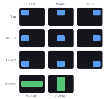
The anchor picker’s nine point anchors — each pins the box to a corner, an edge midpoint, or the centre of its parent — plus a per-axis Stretch that makes the box fill that axis.
The editor’s anchor picker — and the same API in code — is a set of shortcuts
that write the box fields above. An anchor is not stored state: the
position/inset/margin fields remain the single source of truth, so a preset
and the live layout can never desync. Each axis is one of four modes:
AnchorAxis |
Writes (per axis) |
|---|---|
Start |
Near inset px(0), far inset auto, margins px(0) — pin the left/top edge. |
Center |
Both insets and both margins auto — engine-centered (see above). |
End |
Far inset px(0), near inset auto, margins px(0) — pin the right/bottom edge. |
Stretch |
Both insets px(0), margins px(0), size auto — the insets drive the size. |
anchorPresetFields({ h, v }) resolves a preset to the fields to write. It
always sets position: Absolute plus the four insets and four margins;
width/height are included only for a Stretch axis, so a non-stretch
axis preserves the size you authored. ANCHOR_AXES lists the four modes in
grid order (for building a preset picker UI).
import {  UINode, AnchorAxis, anchorPresetFields, detectAnchor, detectAnchorAxes,} from 'esengine';
// Anchor a badge to the top-right corner.const node = world.get(badge, UINode);Object.assign(node, anchorPresetFields({ h: AnchorAxis.End, v: AnchorAxis.Start }));node.insetRight = { ...node.insetRight, value: 16 };  // 16px in from the rightnode.insetTop = { ...node.insetTop, value: 16 };world.insert(badge, UINode, node);
detectAnchor(node);      // → { h: AnchorAxis.End, v: AnchorAxis.Start }detectAnchorAxes(node);  // → per-axis; an axis is null when hand-tuned
detectAnchor(node) classifies a UINode back to the preset it matches — it
round-trips with anchorPresetFields — and returns null for Relative nodes
or boxes that aren’t a clean preset. detectAnchorAxes(node) classifies each
axis independently (h/v, each AnchorAxis | null), so a box with one
hand-tuned axis still reads — and can keep — the other.
Layout timing and UILayoutGeneration
Section titled “Layout timing and UILayoutGeneration”The layout runs in PreUpdate (before your Update systems) and re-solves in
PostUpdate after scroll/list mutations, so gameplay systems always see
current geometry. Each solve increments the UILayoutGeneration resource —
a monotonic counter you can watch to invalidate anything you cache off computed
UI geometry (the built-in pointer hit-testing uses it exactly this way):
import { defineSystem, Res, UILayoutGeneration } from 'esengine';
let seen = -1;const trackLayout = defineSystem([Res(UILayoutGeneration)], (gen) => {  if (gen.generation === seen) return;  // layout unchanged since last frame  seen = gen.generation;  // Layout re-solved: re-read computed UI geometry, rebuild cached rects…});
Recipes
Section titled “Recipes”Full-screen scrim
Section titled “Full-screen scrim”import { spawnUIEntity } from 'esengine';
const scrim = spawnUIEntity({ world, node: { fill: true }, // Absolute + all four insets px(0) visual: { color: { r: 0, g: 0, b: 0, a: 0.6 } },});Center a panel
Section titled “Center a panel”Two equivalent tools: give the parent a centering FlexContainer
(justifyContent: Center, alignItems: Center — the quickstart pattern in
UI), or make the panel itself Absolute with all-auto
insets and margins (the Center anchor — no parent
container needed).
HUD corner badge
Section titled “HUD corner badge”import { spawnUIEntity, UIPositionType, px } from 'esengine';
const badge = spawnUIEntity({ world, parent: hudRoot, node: { position: UIPositionType.Absolute, insetTop: px(16), insetRight: px(16), // other edges stay auto width: px(48), height: px(48), }, visual: { color: { r: 0.9, g: 0.2, b: 0.2, a: 1 } },});Responsive column
Section titled “Responsive column”Percent width with a pixel cap — fluid on phones, capped on wide screens.
min/max aren’t in the spawnUIEntity init, so set them on the component:
import { spawnUIEntity, UINode, px, percent } from 'esengine';
const column = spawnUIEntity({ world, parent: root, node: { width: percent(90) } });const n = world.get(column, UINode);n.maxWidth = px(480);world.insert(column, UINode, n);
Stretch children / spacer
Section titled “Stretch children / spacer”alignItems defaults to Stretch, so children of a Row already fill its
height. Along the main axis, use flexGrow — a grow-only spacer pushes
siblings apart:
import { spawnUIEntity, FlexContainer, FlexDirection, px, percent } from 'esengine';
const toolbar = spawnUIEntity({ world, node: { height: px(48), width: percent(100) } });world.insert(toolbar, FlexContainer, {  direction: FlexDirection.Row,  gap: { x: 8, y: 0 }, padding: { left: 8, top: 4, right: 8, bottom: 4 },});
spawnUIEntity({ world, parent: toolbar, text: { content: 'Title' } });spawnUIEntity({ world, parent: toolbar, node: { flexGrow: 1 } });  // spacerspawnUIEntity({ world, parent: toolbar, text: { content: '99:59' } });
Low-level builders
Section titled “Low-level builders”spawnUIEntity composes three pure builders you can also use directly when
inserting components yourself — each fills a sparse init out to a complete
component literal:
buildUINode(init)— a fullUINodeData.fill: trueis the common widget case:Absolute+ all insetspx(0). Withoutfill, the default isRelativewithautosize — note thatspawnUIEntitywith nonodeinit produces this relative auto box, not a parent-filling one.buildUIVisual(init)— a fullUIVisualData(default: solid white).buildText(init)— a fullTextDatawith widget-flavored defaults (14px, centered, no wrap) — deliberately different from theTextcomponent’s own defaults (24px, left/top, wrap), which target free-standing labels.setUIVisible(world, entity, visible)— togglesUIVisual.enabled(no-op without aUIVisual). For hiding a whole subtree, setUINode.displaytoUIDisplay.Noneinstead.
import { UINode, UIVisual, buildUINode, buildUIVisual, px } from 'esengine';
const e = world.spawn();world.insert(e, UINode, buildUINode({ width: px(200), height: px(40) }));world.insert(e, UIVisual, buildUIVisual({ color: { r: 0.2, g: 0.2, b: 0.25, a: 1 } }));
Best practices
Section titled “Best practices”- Flex first — express layout with containers,
flexGrow, andpercent; reach forAbsoluteonly for overlays, badges, and floating panels. - Anchor with presets —
anchorPresetFieldswrites the correct inset/margin combination (especiallyCenter’s all-autorule) so you don’t have to remember it. - Never position UI via
Transform— the layout pass overwrites it every frame; move boxes with insets and margins. - Cap fluid sizes — pair
percentwidths withmaxWidth: px(...)for wide-screen sanity. - Hide subtrees with
display: None, single visuals withUIVisual.enabled.
See also
Section titled “See also”- UI — the component model overview and quickstart.
- UI Text — how
Textmeasures and aligns inside the box. - UI Interaction — hit-testing the laid-out boxes.
- UI Components — widgets built on these primitives (incl. mobile safe areas).
- Camera — cameras, canvas scale modes, and the UI box.