UI Components
The widget factories build common controls out of the UI component
model (UINode + Interactable + a $interaction
controller with gears), so you don’t wire
each one by hand. Each factory takes an options object and returns a handle —
always with entity and dispose(), plus imperative methods to read and drive it.
Interactive widgets need the world and the UI event queue — world from GetWorld()
and events from Res(UIEvents), exactly as in the UI guide. They
all accept parent?, a node? (UINode layout — default:
fill the parent), and visual overrides; visual defaults come from the active
theme’s roles and re-resolve on a live theme swap.
Interactive widgets are keyboard-reachable by default: they carry a Focusable,
so Tab reaches them, Enter/Space clicks them, and arrow keys drive sliders — opt out
with focusable: false.
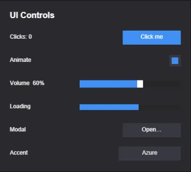
The built-in widgets (from the ui-controls example): a Button, a Toggle, a
Slider, a Progress bar, and buttons that open a Dialog and cycle an accent
color — each a plain entity tree with the UI components on it.
Button
Section titled “Button”createButton(opts) spawns a clickable entity (with an optional child label) that
transitions between visual states. Returns a ButtonHandle. A click is a
press-then-release over the button — or Enter/Space while it has keyboard focus.
import { createButton } from 'esengine';
const btn = createButton({ world, events, parent, text: 'Play', node: { width: px(160), height: px(44) }, states: { normal: { color: { r: 0.20, g: 0.55, b: 1.0, a: 1 } }, hover: { color: { r: 0.30, g: 0.65, b: 1.0, a: 1 } }, pressed: { color: { r: 0.12, g: 0.45, b: 0.9, a: 1 } }, disabled:{ color: { r: 0.3, g: 0.3, b: 0.3, a: 1 } }, }, onClick: (entity) => { /* … */ },});| Option | Default | Description |
|---|---|---|
node |
fill the parent | The button’s UINode layout. |
text |
none | Label — a string or a TextInit. Omit for no label. The label color/size default to the theme’s text role and label type size. |
states |
theme control roles | Map of state name (normal / hover / pressed / disabled / focused) → color / sprite / scale override. Custom names (e.g. 'loading') are allowed. |
background |
solid white | Background visual (a UIVisualInit). |
fadeDuration |
0 (snap) |
Tween time for color/scale state changes; sprite swaps always snap. |
disabled |
false |
Start disabled. |
focusable / tabIndex |
true / 0 |
Keyboard reachability and Tab order. |
onClick(entity) |
— | Click callback (gated on the enabled state). |
Handle: entity, setDisabled(disabled), dispose().
The theme-default states are also exported as themeButtonStates() — spread and
override them instead of restating all five. Flip a custom state later with
setButtonState(world, handle.entity, 'loading'); the pointer driver leaves any
non-canonical page alone until you switch back.
Toggle
Section titled “Toggle”createToggle(opts) composes a button with an on/off check indicator. Returns a
ToggleHandle.
import { createToggle } from 'esengine';
const toggle = createToggle({  world, events, parent,  interactionStates: { normal: { color: /* … */ }, hover: { /* … */ }, pressed: { /* … */ } },  check: { color: { r: 0.2, g: 0.8, b: 0.4, a: 1 } },   // the "on" indicator  isOn: true,  onChange: (isOn, entity) => { /* … */ },});
toggle.setValue(false); // programmatic change (fires onChange)| Option | Default | Description |
|---|---|---|
node / background |
fill the parent / solid white | Frame layout + background, as in createButton. |
interactionStates |
theme control roles | Frame visual states (like the button’s states). |
check |
theme primary fill |
The on-state indicator: { node?, color?, sprite? }, a child shown when on. Fills the frame by default — inset it via check.node. |
isOn |
false |
Initial state. |
disabled |
false |
Start disabled. |
focusable / tabIndex |
true / 0 |
Keyboard reachability. |
onChange(isOn, entity) |
— | Fires on toggle. |
Handle: getValue(), setValue(value), setDisabled(disabled), entity, dispose().
Slider
Section titled “Slider”createSlider(opts) builds a track + fill + handle. Returns a SliderHandle.
Input is built in: drag anywhere on the track (press captures until release),
or focus it and use arrow keys (step, or 1% of the range when continuous),
Home/End.
import { createSlider } from 'esengine';
const slider = createSlider({  world, events, parent,  min: 0, max: 100, value: 50, step: 5,  onChange: (value) => { /* … */ },});
slider.setValue(75);| Option | Default | Description |
|---|---|---|
node |
fill the parent | The track’s UINode layout. |
min / max |
0 / 1 |
The range. |
value |
min |
Initial value (clamped and step-quantized). |
step |
0 (continuous) |
Quantization step. Also the keyboard nudge. |
handleWidth |
12 |
Thumb width in pixels. |
disabled / focusable / tabIndex |
false / true / 0 |
Interactivity + keyboard reachability. |
trackVisual / fillVisual / handleVisual |
theme track / primary / onPrimary |
Per-part visuals. |
onChange(value, entity) |
— | Fires on value change — from input, setValue, or any other writer. |
Handle: getValue(), setValue(v), dispose(), plus entity /
trackEntity (the same entity) / fillEntity / handleEntity.
Progress
Section titled “Progress”createProgress(opts) is a non-interactive fill bar. Returns a ProgressHandle.
It takes no events — nothing to interact with.
import { createProgress } from 'esengine';
const bar = createProgress({  world, parent,  direction: 'right',  fill: { color: { r: 0.2, g: 0.8, b: 0.4, a: 1 } },  value: 0,});
bar.setValue(0.6);   // 0..1
// Radial gauge (cooldown / ring meter) — a clockwise wedge from 12 o'clock:const ring = createProgress({ world, parent, radial: true, value: 0.75 });| Option | Default | Description |
|---|---|---|
node |
fill the parent | The track’s UINode layout. |
value |
0 |
Initial progress, 0..1 (clamped). |
direction |
'right' |
Linear fill growth: 'right', 'left', 'up', 'down'. |
radial |
false |
Radial gauge instead of a bar — a clockwise wedge sweeping the full circle. Ignores direction. |
background |
theme track |
Track visual (a UIVisualInit). |
fill |
theme primary |
The filled bar: { color?, sprite? }. |
Handle: getValue(), setValue(v), dispose(), plus entity / fillEntity.
Dropdown
Section titled “Dropdown”createDropdown(opts) shows the current selection and opens a popup of option rows.
It’s generic over the option type. Returns a DropdownHandle<T>.
import { createDropdown } from 'esengine';
const dd = createDropdown({  world, events, parent,  options: ['Low', 'Medium', 'High'],  selectedIndex: 1,  onSelect: (index, option) => { /* … */ },});
// Objects need a label mapper:createDropdown({ world, events, parent, options: resolutions, // e.g. { w, h }[] optionToLabel: (r) => `${r.w}×${r.h}`, onSelect: (i, r) => applyResolution(r),});| Option | Default | Description |
|---|---|---|
node |
fill the parent | The main button’s UINode layout. |
options |
— | The list of selectable values. Required. |
selectedIndex |
0 |
Initial selection. |
optionToLabel(option, i) |
String(option) |
Map a non-string option to its display text. |
buttonStates |
theme control roles | { normal?, hover?, pressed? } colors for the main button (option rows use theme roles). |
optionHeight |
32 |
Row height in pixels. |
disabled / focusable / tabIndex |
false / true / 0 |
Interactivity + keyboard reachability. |
onSelect(index, option, entity) |
— | Fires on selection. |
Handle: getSelected(), getSelectedIndex(), setSelectedIndex(i),
open(), close(), isOpen(), dispose(), plus entity / labelEntity
(the child Text showing the current selection).
Dialog
Section titled “Dialog”createDialog(opts) is a modal: a click-blocking backdrop with a centered panel,
hidden until opened. Returns a DialogHandle. Add your content as children of
panelEntity — closing sets display: none on the backdrop root, so the whole
subtree (your content included) leaves layout, rendering, and input in one write.
import { createDialog, spawnUIEntity } from 'esengine';
const dialog = createDialog({  world, events, parent,  panelNode: { width: px(420), height: px(260) },});
spawnUIEntity({ world, parent: dialog.panelEntity, text: { content: 'Are you sure?' } });
dialog.open();// …laterdialog.close();| Option | Default | Description |
|---|---|---|
backdropNode / backdropVisual |
fill the parent / theme backdrop scrim |
The full-viewport scrim behind the panel. It blocks pointer hits but is not focusable. |
panelNode / panelVisual |
400×300 centered / theme surface |
The modal panel. The panel swallows clicks so only true scrim clicks dismiss. |
startHidden |
true |
Start closed. |
closeOnEscape / closeOnBackdrop |
true / true |
The standard dismissals — Escape, and a click on the scrim (not the panel). |
onOpenChange(open) |
— | Fires on every open/close, whoever initiated it. |
While a dialog is open it also traps the Tab ring: only focusables inside the open dialog’s subtree participate (the scrim already blocks pointer focus outside).
Handle: open(), close(), isOpen(), dispose(), plus entity (the
backdrop root) / panelEntity.
Text input
Section titled “Text input”createTextInput(opts) builds an editable field — background, caret, placeholder,
and IME plumbing included — with theme-role colors that re-resolve on a theme swap.
Returns a TextInputHandle: getValue() / setValue(v) / entity / dispose().
import { createTextInput } from 'esengine';
const name = createTextInput({ world, events, parent, placeholder: 'Your name', maxLength: 20, onChange: (value) => { /* value edited */ }, onSubmit: (value) => save(value), // Enter});| Option | Default | Description |
|---|---|---|
node |
220×32 | The field’s UINode layout (the one factory that doesn’t default to fill-parent). |
value / placeholder |
'' |
Content / hint shown while empty. |
maxLength |
0 |
Character cap (0 = unlimited). |
multiline |
false |
Enter inserts a newline instead of submitting. |
password |
false |
Mask the characters. |
readOnly |
false |
Focusable but not editable. |
fontSize / fontFamily |
theme label size / 'Arial' |
Text style. |
color / backgroundColor / placeholderColor |
theme text / control / faded text |
Color overrides — theme roles when omitted. |
padding |
6 |
Inner horizontal padding in px. |
renderMode |
Auto |
Glyph pipeline for the field text — Auto (crisp bitmap when unscaled, SDF once scaled), always Bitmap, or always Sdf. |
disabled / tabIndex |
false / 0 |
Interactivity + Tab order. Text fields are always focusable — that is what they are for. |
onChange(value, entity) |
— | Fires on every edit. |
onSubmit(value, entity) |
— | Fires on Enter (single-line). |
The factory is sugar over the TextInput component — insert that directly on any
UI entity for full manual control (same fields as above, plus the live focused /
cursorPos state):
import { spawnUIEntity, TextInput, px } from 'esengine';
const field = spawnUIEntity({ world, parent, node: { width: px(240), height: px(32) } });world.insert(field, TextInput, { placeholder: 'Your name', maxLength: 20 });
events.on(field, 'change', () => { /* value edited */ });events.on(field, 'submit', () => save(world.get(field, TextInput).value));  // Enter
Click (or Tab to) the field to focus it; Escape blurs, Enter fires
submit on single-line fields. A value longer than the box clips to it and scrolls
horizontally so the caret stays in view as you type.
Editing is backed by a hidden native <textarea>, so caret movement and
selection come for free: click to place the caret at that character,
arrows / Home / End move it, Shift + arrows (or Ctrl/⌘ + A) select a
range — drawn as a highlight behind the text — and the platform clipboard (cut /
copy / paste) works. The field mirrors that native selection each frame, so it
always matches what a native input would do.
IME / CJK input works: the field drives a hidden native <textarea>, so a
Chinese/Japanese/Korean composition renders live in the field (the preedit
string shows at the caret as you type) and only fires change once the
composition commits — the same behavior as a native input. The textarea tracks
the caret’s on-screen position, so the OS candidate window pops up at the
caret, not in a screen corner.
A multiline field (Enter inserts a newline) stacks its lines from the top;
the caret position, click-to-place and within-line selection track the
\n-broken lines (soft word-wrap is not modeled — lines break on explicit
newlines).
Lists & scrolling
Section titled “Lists & scrolling”Virtualized data-driven lists and grids (createListView), free-form scrollable
panels (createScrollView), data sources, layout providers, auto-height rows, and
the kinetic-scroll / scrollbar machinery have their own chapter:
Lists & Scrolling.
Data binding
Section titled “Data binding”Widget values are plain component fields (UISlider.value, UIToggle.isOn, …), so
the signal layer binds to them directly — and bindWidgetValue makes it two-way.
See UI Binding.
Drag & drop
Section titled “Drag & drop”Add Draggable to any interactable UI entity and pointer drags move it, with
drag_start / drag_move / drag_end events and a live DragState component.
Axis locks and range clamps included. See
UI Interaction.
Keyboard focus
Section titled “Keyboard focus”Entities with a Focusable participate in keyboard focus: Tab / Shift+Tab cycle
by tabIndex, Enter/Space activate, sliders take the arrow keys, and a focused
control shows its focused interaction page. Widget factories add Focusable
automatically (focusable: false opts out); the FocusManager resource gives
programmatic control. Details in UI Interaction.
Safe area (mobile notches)
Section titled “Safe area (mobile notches)”Add SafeArea to a full-screen, absolutely-positioned UINode container and its
insets track the platform safe area — notches, rounded corners, the WeChat capsule —
with per-edge opt-outs. See Screen & Resolution.
Theming
Section titled “Theming”Widget colors come from a shared token set with roles like surface, control,
primary, and track; switchTheme(world, tokens) live-restyles everything on
screen, and a project declares its palette once in Project Settings → UI.
See UI Theme.
Editor prefabs
Section titled “Editor prefabs”The same widgets ship as editor prefabs, so Create… → UI drops a ready-made Button, Toggle, Slider, Dialog, TextInput, and so on into the scene, which you then edit in Details. Behavior that lives in components — a slider’s drag/keys, a dialog’s Escape/scrim dismissal — works on placed prefabs without code.
Dropping from the palette nests: the drop parents into the layout container under the pointer (a dashed outline previews the would-be parent while you drag), and an empty-canvas drop lands at the root as before. The anchor picker edits per axis and keeps the widget exactly where it was — changing the horizontal anchor never disturbs the vertical layout, and vice versa. See The Editor.
Best practices
Section titled “Best practices”- Prefer the state components over handle juggling.
UIToggle.isOn,UISlider.value,UIDropdown.selectedIndexare the single source of truth — write them (or bind them) and the visuals follow; the handle methods are just typed sugar over the same writes. - Let the theme own colors. Omit
states/ visuals to get theme roles that re-resolve on a live swap; hard-code colors only for deliberately off-theme art. - Put dialog content under
panelEntity, never beside it — that’s what makes open/close a singledisplaywrite for the whole subtree. - Dispose handles you created at runtime —
dispose()despawns the widget’s entities and detaches its event subscriptions. - Keep keyboard reachability on. Only pass
focusable: falsefor decorative or duplicate controls; the Tab ring is your accessibility story.
See also
Section titled “See also”- UI — the component model:
UINode,Text,UIVisual, interaction. - Lists & Scrolling —
createListView,createScrollView, virtualization. - UI Controllers — shared “page” state + declarative per-page field bindings.
- UI Binding — signals and two-way widget binding.
- UI Interaction — focus, drag & drop, pointer events.
- UI Theme — tokens, roles, live theme swaps, the project theme.