UI Controllers & Gears
A controller is a named enum of pages scoped to a UI root — { up, over, down },
{ home, shop, about }, { closed, open }. A gear binds one component field to a
value per page, so when the controller switches page, every geared element reflows —
color, position, visibility, text, or any reflected field, snapping or tweening.
One controller drives many elements, and the whole thing is plain ECS data (two
components, UIController and UIGear) that travels with a prefab
and serializes into a scene. It is the shared, multi-page generalization of the
per-widget state a button uses — one mechanism for
tabs, radio groups, button states, and show/hide panels.
Controllers
Section titled “Controllers”Put a UIController on a UI root (a Canvas or any node). It holds one or more named
controllers, each with a page list and the current page:
import { UIController, controllerState, setControllerPage, getControllerPage } from 'esengine';
world.insert(root, UIController, {  controllers: [controllerState('tab', ['home', 'shop', 'about'], 'home')],});
setControllerPage(world, anyDescendant, 'tab', 'shop');   // switch pagegetControllerPage(world, anyDescendant, 'tab');           // → 'shop'
controllerState(name, pages, current?) builds one controller (current defaults to the
first page). setControllerPage / getControllerPage resolve the nearest controller of
that name walking self → ancestors, so a gear on a leaf finds the controller on the
root. setControllerPage is a no-op on an unknown controller, an unknown page, or the
current page (it guards typos rather than failing).
ControllerState field |
Description |
|---|---|
name |
Controller name, referenced by gears (e.g. "tab", "$interaction"). |
pages |
Ordered page names — the enum’s members. |
current |
The currently selected page. |
Put a UIGear on any element under the controller. Each binding says “while controller
C is on page P, this field holds value V”:
import { UIGear, gearBinding, EasingType } from 'esengine';
world.insert(card, UIGear, {  bindings: [    // The card's colour follows the 'tab' page, easing over 0.18s.    gearBinding('tab', 'UIVisual', 'color', {      home:  { r: 0.16, g: 0.18, b: 0.26, a: 1 },      shop:  { r: 0.21, g: 0.16, b: 0.26, a: 1 },      about: { r: 0.15, g: 0.23, b: 0.21, a: 1 },    }, { easing: EasingType.EaseOutCubic, duration: 0.18 }),
    // Its label text follows the same page (strings snap — no interpolation).    gearBinding('tab', 'Text', 'content', {      home: 'Welcome home', shop: 'Buy stuff', about: 'About us',    }),  ],});
gearBinding(controller, component, property, pages, tween?) addresses a field the same
way a Timeline property track does — a component name plus a
dot-path property ("color", "color.a", "scale.x"). pages is a sparse map
keyed by page name: a page with no entry leaves the field untouched.
GearBinding field |
Description |
|---|---|
controller |
Which controller drives this (resolved self → ancestors). |
component |
Target component name — "UIVisual", "Transform", "Text", "UINode". |
property |
Dot-path within the component ("color", "color.a", "scale"). |
pages |
page → value map; a page absent here leaves the field alone. |
tween? |
{ easing, duration } to interpolate on page change; omit for an instant snap. |
Values — numbers, colours ({r,g,b,a}), and vectors ({x,y,z}) interpolate when the
binding has a tween; strings and booleans always snap. A geared element is owned by the
controller for that field: on each page change the gear applies the page’s value.
A button, without bespoke state
Section titled “A button, without bespoke state”The built-in controller name $interaction is driven by pointer state
(normal / hover / pressed / disabled). Give an element an $interaction
controller + an Interactable + a gear, and it gets its button states through the
same mechanism as everything else — this is what createButton itself is made of:
import { UIController, UIGear, interactionController, gearBinding, EasingType } from 'esengine';
world.insert(btn, UIController, { controllers: [interactionController()] });world.insert(btn, Interactable, { enabled: true, blockRaycast: true, raycastTarget: true });world.insert(btn, UIGear, {  bindings: [gearBinding('$interaction', 'UIVisual', 'color', {    normal:   { r: 0.30, g: 0.33, b: 0.42, a: 1 },    hover:    { r: 0.39, g: 0.43, b: 0.55, a: 1 },    pressed:  { r: 0.22, g: 0.24, b: 0.32, a: 1 },    disabled: { r: 0.20, g: 0.20, b: 0.24, a: 0.6 },  }, { easing: EasingType.EaseOutCubic, duration: 0.1 })],});
interactionController(pages?) defaults to the four canonical pages. Because a gear can
drive any field, the same button can also gear its scale, a child icon’s tint, or a
label — all four states, one mechanism.
Authoring in the editor
Section titled “Authoring in the editor”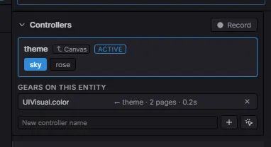
The Controllers strip: the active controller (here theme, inherited from the Canvas), its pages as chips (sky / rose), and Gears on this entity — every field bound to a controller.
Everything above can be authored visually — no code. Select any UI entity and the Controllers panel (revealed in UI mode) lists every controller it can see — its own plus each ancestor’s (inherited rows carry the owner’s name), so the root’s controllers stay switchable while you work on a geared leaf:
- Add a controller (the pointer-button preset adds
$interactionwith its four pages in one click), then manage pages as chips: click to preview, double-click to rename, drag to reorder, and the hover × deletes — renames cascade into every gear binding that resolves to the controller, and deleting a page clears its recorded values. - Click a controller to make it active. In the Details panel, every field then shows a small gear dot — click it to bind that field to the active controller (seeding the current page with the field’s value). Click a bound dot to open its settings: the page-change transition (duration + easing, 0 = snap) and unbind.
- Turn on Record: now every edit writes into the controller’s current page — a field with no gear yet gears itself automatically (auto-key), and bound gear dots glow red while recording. Switch page, edit, switch page, edit — each page captures its own values. This is the fast path — “pick a page, change things, it’s recorded”.
- The panel’s Gears on this entity list shows every binding the selected entity carries — field, driving controller, page count, transition — with one-click removal.
Controllers and gears are components, so they save into the scene / prefab like anything else, and instance with it.
Data-driven pages
Section titled “Data-driven pages”Two bridges switch pages from data or logic, each reusing an existing system.
From a signal — bindControllerPage drives a controller’s page from a
reactive signal, the declarative path to a data-driven tab bar:
import { signal, bindControllerPage } from 'esengine';
const activeTab = signal('home');bindControllerPage(world, root, 'tab', activeTab);  // the controller follows the signal
activeTab.set('shop');   // page switches, every geared element reflows
From a button, with no code — an event wire on the button
runs ui.setPage when it is clicked, targeting the entity that owns the controller:
{ "event": "click", "action": "ui.setPage", "params": { "controller": "tab", "page": "shop" } }From a state machine — the ui.setPage action lets a data-driven
FSM / behavior tree (.esfsm / .esbt) switch a page with no code.
Its argument is "controller:page":
{ "onEnter": { "name": "ui.setPage", "arg": "hud:alert" } }This is the same layering as the built-in timeline.play glue: logic (.esfsm) →
controller state → gear presentation.
Best practices
Section titled “Best practices”- Controller on the root, gears on the leaves. Resolution walks up the tree, so a
controller on the
Canvasdrives gears anywhere under it. - One controller, many gears. A tab controller drives the tab highlights, the content panel, and its label — set the page once, everything follows.
- Snap vs tween. Add a
tweenfor colour/position/scale transitions; leave it off for text and visibility (which snap anyway). - Radio buttons via one controller — give each tab button a gear that’s the accent colour on its own page and muted on the others.
- Switch pages from data, not scattered mutations —
bindControllerPage(signal)orui.setPagekeep the “what page am I on” decision in one place.
See also
Section titled “See also”- UI — the flexbox component model gears drive.
- UI Components — the widget factories.
- Timeline — keyframed transitions; gears use the same field addressing.
- Gameplay AI — the
.esfsm/.esbtthat can callui.setPage. - Event Binding — wire a click straight to
ui.setPage, no code.