UI
Estella’s UI is a CSS-like flexbox system solved in the C++ core. You compose an
interface from UI components — visually in the editor or in code — and handle
interaction from your systems. There is no RectTransform: UINode is real
flexbox, sized with px / percent / auto plus Absolute insets.
This page is the overview: the component model, a quickstart, and a map of the detailed UI guides. Deep reference for each area lives in its own chapter.
The components
Section titled “The components”| Component | Role | Guide |
|---|---|---|
UINode |
The layout box; holds the per-item flex fields (size, grow/shrink, margin, inset). | UI Layout |
FlexContainer |
Lays a node’s children out with flexbox (direction, justify, align, gap, padding). | UI Layout |
Text |
Text via a dynamic glyph atlas (content, font, color, align, stroke, shadow, rich text). | UI Text |
UIVisual |
The fill — solid color, texture, 9-slice, tiled, or filled. | below |
UIMask |
Clips its children. | below |
Interactable |
Marks a node hit-testable so it can be hovered/clicked. | UI Interaction |
UIInteraction |
Engine-written per-frame pointer state (read-only for your logic). | UI Interaction |
Quickstart: a pause menu
Section titled “Quickstart: a pause menu”A complete pause menu — a centered column panel with a title and a button — built once from a startup system:
import {  defineSystem, addStartupSystem, GetWorld, Res, UIEvents,  spawnUIEntity, createButton,  FlexContainer, FlexDirection, JustifyContent, AlignItems, px,} from 'esengine';
const buildPauseMenu = defineSystem([GetWorld(), Res(UIEvents)], (world, events) => {  // A panel: 320×220 with a dark translucent background.  const panel = spawnUIEntity({    world,    node: { width: px(320), height: px(220) },    visual: { color: { r: 0.08, g: 0.10, b: 0.16, a: 0.95 } },  });
  // Lay its children out as a centered vertical column.  world.insert(panel, FlexContainer, {    direction: FlexDirection.Column,    justifyContent: JustifyContent.Center,    alignItems: AlignItems.Center,    gap: { x: 0, y: 16 },  });
  // A title, parented to the panel.  spawnUIEntity({ world, parent: panel, text: { content: 'Paused', fontSize: 28 } });
  // A button that resumes the game on click.  createButton({    world, events, parent: panel, text: 'Resume',    node: { width: px(160), height: px(44) },    states: {      normal:  { color: { r: 0.20, g: 0.55, b: 1.0, a: 1 } },      hover:   { color: { r: 0.30, g: 0.65, b: 1.0, a: 1 } },      pressed: { color: { r: 0.12, g: 0.45, b: 0.9, a: 1 } },    },    onClick: () => { /* unpause, switch scene, hide the menu… */ },  });});
addStartupSystem(buildPauseMenu);
spawnUIEntity({ world, parent?, node?, visual?, text? }) returns the entity; pass
parent to nest. Sizes use the dimension helpers px, percent, auto — all
in design pixels (see UI Layout).
The other widget factories work the same way: createToggle, createSlider,
createProgress, createDialog, createDropdown — see
UI Components.
How the pieces fit
Section titled “How the pieces fit”Each layer builds on the one before it:
- Layout —
UINodeboxes, solved by the flexbox engine;FlexContainerarranges children,Absoluteinsets place overlays. → UI Layout - Visuals & text —
UIVisualfills the box,UIMaskclips,Textdraws crisp glyphs. → UI Text - Interaction —
Interactablemakes a box hit-testable; the engine writes pointer state intoUIInteractionand emits bubblingUIEvents; drag & drop and keyboard focus sit on top. → UI Interaction - Widgets — factories (
createButton,createSlider, …) compose the three layers into ready-made controls;createListViewadds virtualized lists. → UI Components, UI Lists - Controllers — a named “page” state per UI root with per-page field bindings (tabs, button states, show/hide) — no code. → UI Controllers
- Theme & binding — design tokens skin every widget (live-switchable), and reactive signals keep UI in sync with game state. → UI Theme, UI Binding
UIVisual and UIMask
Section titled “UIVisual and UIMask”UIVisual draws the node’s background; visualType selects the mode:
UIVisualType |
Uses | Description |
|---|---|---|
None |
— | Invisible (layout/hit-test only). |
SolidColor |
color |
Tinted quad. |
Image |
texture, uvOffset, uvScale |
Textured quad / sprite region. |
NineSlice |
sliceBorder |
Scalable panel with fixed corners. |
Tiled |
tileSize |
Texture repeated across the box. |
Filled |
fillAmount, fillMethod, fillOrigin |
Cropped fill (health/progress bars, cooldown rings). |
UIVisual.enabled hides this entity’s visual only; UINode.display = None
removes the node and its whole subtree from layout, rendering, and
hit-testing. Add UIMask to a node to clip its children to the box.
Editor or code
Section titled “Editor or code”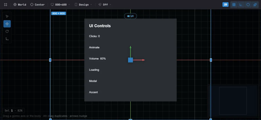
A UI Canvas in the editor — laid out against the design frame, with the selected node’s gizmo. The same widgets author from code or the editor.
Both author the same components — there is no separate editor format:
- Editor — Create… → UI drops widget prefabs (Button, Toggle, Slider, Dialog, …); nest by dragging, edit every field in Details, place with the per-axis anchor picker, and preview against the project’s design resolution and device presets. See The Editor.
- Code —
spawnUIEntity+ the widget factories, from a startup system as above. Anything the editor writes, code can write too.
Where to go next
Section titled “Where to go next”| You want to… | Open |
|---|---|
Size and place boxes — px/percent/auto, flexbox, absolute insets, anchors |
UI Layout |
| Draw text — fonts, SDF/bitmap crispness, wrapping, rich text | UI Text |
React to pointer & keyboard — clicks, UIEvents, drag & drop, focus |
UI Interaction |
| Use ready-made controls — button, toggle, slider, dialog, dropdown, input | UI Components |
| Show scrolling data — virtualized lists and grids | UI Lists |
| Skin everything — design tokens, project theme, live switching | UI Theme |
Keep UI in sync with game state — signals, bind, two-way widget binding |
UI Binding |
| Share state across elements — tabs, radio groups, page-driven visuals | UI Controllers |
Best practices
Section titled “Best practices”- Flex, not absolute — lay out with
FlexContainer+flexGrow; reserveAbsoluteinsets for overlays and badges. - Size with
percent/autofor resolution independence; hardpxonly where a fixed size is intended. - Drive logic from
UIInteractionorUIEvents, never by mutating them. - Reuse the widget factories for consistent state visuals instead of wiring hover/press by hand.
- 9-slice panels (
NineSlice) keep borders crisp at any size.
See also
Section titled “See also”- Input — raw keyboard/mouse/touch below the UI layer.
- Localization — bind
Text.contentto translated keys. - Animation — tween UI color/position for juice.
- The Editor — visual authoring, prefabs, anchor picker.