UI
Estella 的 UI 是在 C++ 内核里求解的 CSS 式弹性盒(flexbox)系统。你用 UI 组件组合界面——
在编辑器里或用代码——并在系统里处理交互。没有 RectTransform:UINode 就是真正的
flexbox,用 px / percent / auto 加 Absolute 内偏移(inset)来定尺寸。
本页是总览:组件模型、快速上手,以及各 UI 详细指南的地图。每个领域的深入参考在各自的章节里。
| 组件 | 职责 | 指南 |
|---|---|---|
UINode |
布局盒;持有逐项的 flex 字段(尺寸、grow/shrink、margin、inset)。 | UI 布局 |
FlexContainer |
用 flexbox 排布一个节点的子项(方向、justify、align、gap、padding)。 | UI 布局 |
Text |
经动态字形图集渲染文本(内容、字体、颜色、对齐、描边、阴影、富文本)。 | UI 文本 |
UIVisual |
填充——纯色、纹理、九宫格、平铺或填充。 | 见下文 |
UIMask |
裁剪它的子项。 | 见下文 |
Interactable |
标记节点可命中,从而能被悬停/点击。 | UI 交互 |
UIInteraction |
引擎每帧写入的指针状态(对你的逻辑只读)。 | UI 交互 |
快速上手:暂停菜单
Section titled “快速上手:暂停菜单”一个完整的暂停菜单——居中的列面板,带标题和一个按钮——用启动系统构建一次:
import {  defineSystem, addStartupSystem, GetWorld, Res, UIEvents,  spawnUIEntity, createButton,  FlexContainer, FlexDirection, JustifyContent, AlignItems, px,} from 'esengine';
const buildPauseMenu = defineSystem([GetWorld(), Res(UIEvents)], (world, events) => {  // A panel: 320×220 with a dark translucent background.  const panel = spawnUIEntity({    world,    node: { width: px(320), height: px(220) },    visual: { color: { r: 0.08, g: 0.10, b: 0.16, a: 0.95 } },  });
  // Lay its children out as a centered vertical column.  world.insert(panel, FlexContainer, {    direction: FlexDirection.Column,    justifyContent: JustifyContent.Center,    alignItems: AlignItems.Center,    gap: { x: 0, y: 16 },  });
  // A title, parented to the panel.  spawnUIEntity({ world, parent: panel, text: { content: 'Paused', fontSize: 28 } });
  // A button that resumes the game on click.  createButton({    world, events, parent: panel, text: 'Resume',    node: { width: px(160), height: px(44) },    states: {      normal:  { color: { r: 0.20, g: 0.55, b: 1.0, a: 1 } },      hover:   { color: { r: 0.30, g: 0.65, b: 1.0, a: 1 } },      pressed: { color: { r: 0.12, g: 0.45, b: 0.9, a: 1 } },    },    onClick: () => { /* unpause, switch scene, hide the menu… */ },  });});
addStartupSystem(buildPauseMenu);
spawnUIEntity({ world, parent?, node?, visual?, text? }) 返回实体;传 parent 来
嵌套。尺寸用维度助手 px、percent、auto——单位都是设计像素(见
UI 布局)。其余控件工厂用法相同:
createToggle、createSlider、createProgress、createDialog、createDropdown——见
UI 组件。
各部分如何协作
Section titled “各部分如何协作”每一层都建立在前一层之上:
- 布局——
UINode盒子由 flexbox 引擎求解;FlexContainer排布子项,Absolute内偏移放置悬浮层。→ UI 布局 - 视觉与文本——
UIVisual填充盒子,UIMask裁剪,Text绘制锐利字形。 → UI 文本 - 交互——
Interactable让盒子可命中;引擎把指针状态写入UIInteraction并发出冒泡的UIEvents;拖放和键盘焦点建立在其上。 → UI 交互 - 控件——工厂(
createButton、createSlider……)把前三层组合成现成的控件;createListView提供虚拟化列表。 → UI 组件、UI 列表 - 控制器——每个 UI 根一份命名“页面”状态加逐页字段绑定(标签页、按钮状态、 显示/隐藏)——零代码。→ UI 控制器
- 主题与绑定——设计 token 给所有控件换肤(可实时切换),响应式 signal 让 UI 与游戏状态保持同步。 → UI 主题、UI 绑定
UIVisual 与 UIMask
Section titled “UIVisual 与 UIMask”UIVisual 绘制节点的背景;visualType 选择模式:
UIVisualType |
使用字段 | 说明 |
|---|---|---|
None |
— | 不可见(仅参与布局/命中测试)。 |
SolidColor |
color |
着色四边形。 |
Image |
texture、uvOffset、uvScale |
贴图四边形 / 精灵区域。 |
NineSlice |
sliceBorder |
角部固定、可缩放的面板。 |
Tiled |
tileSize |
纹理在盒内平铺重复。 |
Filled |
fillAmount、fillMethod、fillOrigin |
裁剪式填充(血条/进度条、冷却环)。 |
UIVisual.enabled 只隐藏本实体的视觉;UINode.display = None 把该节点连同整棵
子树从布局、渲染和命中测试中移除。给节点加 UIMask 可把子项裁剪到盒内。
编辑器还是代码
Section titled “编辑器还是代码”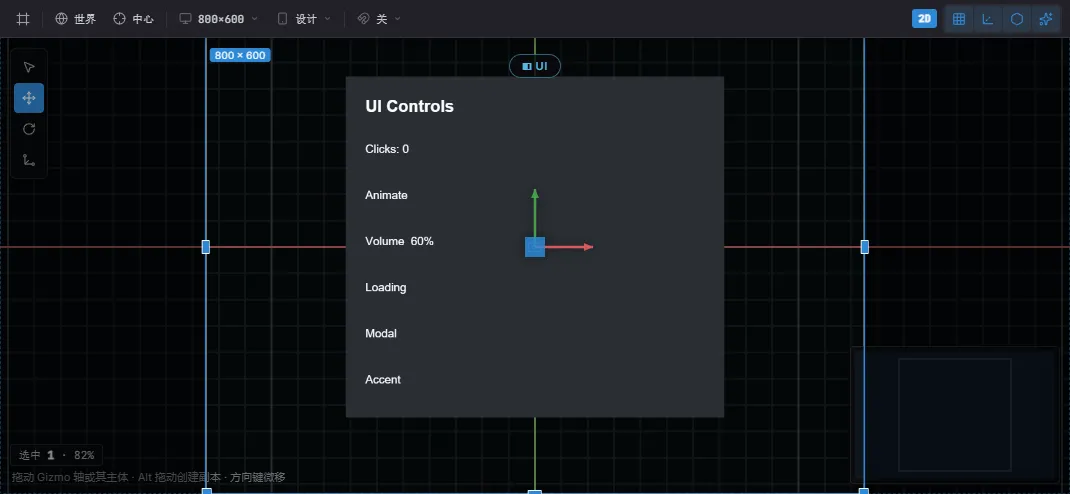
编辑器里的一个 UI Canvas——依据设计框排布,带选中节点的 gizmo。同一套控件既能从代码写,也能在编辑器里排。
两者书写的是同一套组件——没有单独的编辑器格式:
- 编辑器——Create… → UI 放入控件预制件(Button、Toggle、Slider、Dialog……); 拖拽嵌套,在 Details 里编辑每个字段,用逐轴锚点选择器摆放,并按项目的设计分辨率 和设备预设预览。见编辑器。
- 代码——
spawnUIEntity+ 控件工厂,如上例在启动系统里构建。编辑器能写的, 代码都能写。
| 你想…… | 打开 |
|---|---|
定尺寸摆盒子——px/percent/auto、flexbox、绝对内偏移、锚点 |
UI 布局 |
| 绘制文本——字体、SDF/位图锐利度、换行、富文本 | UI 文本 |
响应指针与键盘——点击、UIEvents、拖放、焦点 |
UI 交互 |
| 使用现成控件——按钮、开关、滑条、对话框、下拉、输入框 | UI 组件 |
| 展示滚动数据——虚拟化列表与网格 | UI 列表 |
| 全局换肤——设计 token、项目主题、实时切换 | UI 主题 |
让 UI 与游戏状态同步——signal、bind、控件双向绑定 |
UI 绑定 |
| 跨元素共享状态——标签页、单选组、页面驱动的视觉 | UI 控制器 |
- 优先 flex 而非绝对定位——用
FlexContainer+flexGrow布局;Absolute内偏移只留给悬浮层和角标。 - 用
percent/auto定尺寸以获得分辨率无关性;只有确实需要固定尺寸时才用 硬编码px。 - 逻辑读
UIInteraction或UIEvents驱动,绝不去改写它们。 - 复用控件工厂以获得一致的状态视觉,而不是手工接线悬停/按下。
- 九宫格面板(
NineSlice)在任意尺寸下保持边框锐利。