UI 布局
UI 几何是一套 CSS 盒模型,由 C++ 内核中的单趟 flexbox 引擎(Yoga)每帧针对相机的 UI
框求解。本页是深入参考:单位、Dimension 类型、UINode 与 FlexContainer 的全部字段、
绝对定位、锚点预设和配方。组件模型总览请从 UI 开始。
单位:设计像素
Section titled “单位:设计像素”UI 布局里的每个 px 都是设计像素——项目设计分辨率(Project Settings → Display)
的单位,而非设备像素。场景相机把设计分辨率的适配烘焙进自己的视野范围,因此在 UI 布局框内
1 世界单位 = 1 设计像素,一个 px(320) 的面板在任何设备上都是 320 设计像素宽;画布
缩放模式决定这个设计框如何适配真实屏幕(letterbox、expand、match)。编辑器的自由缩放视图
针对同一个固定设计框排布 UI,所以缩放视口永远不会让界面重排。见
屏幕与分辨率和相机。
维度:px、percent、auto
Section titled “维度:px、percent、auto”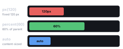
三种长度单位:px 是固定的设计像素尺寸,percent 是父项对应轴的比例,auto 收缩到内容大小(或被容器拉伸)。
每个长度字段都是一个 Dimension——{ value, unit }——用三个助手构造:
import { px, percent, auto, isAuto, DimensionUnit } from 'esengine';
px(320) // 320 design pixelspercent(50) // 50% of the parent's corresponding axis (0..100, not 0..1)auto() // content-/layout-driven; value is ignoredisAuto(d) // true when d is the auto lengthpx(n)——绝对设计像素(DimensionUnit.Px)。percent(n)——父项对应轴的百分比:width: percent(50)是父项宽度的一半,height: percent(50)是父项高度的一半。取值 0–100,与 CSS%一致。auto()——“让布局决定”。具体含义取决于字段:
| 字段 | auto() 的含义 |
|---|---|
width / height |
内容驱动(文本测量、子项)或被容器拉伸;根节点在 auto 轴上填满相机框。 |
minWidth/Height、maxWidth/Height |
无约束。 |
flexBasis |
使用 width/height,否则用内容尺寸。 |
insetLeft/Top/Right/Bottom |
该边不受约束(见绝对定位)。 |
marginLeft/Top/Right/Bottom |
外边距吸收剩余空间(CSS margin: auto);Absolute 节点上全 auto 的外边距 + 内偏移会使该轴居中。 |
UINode——盒子
Section titled “UINode——盒子”UINode 持有逐项布局字段(容器级字段在 FlexContainer 上)。以下默认值来自 SDK 源码的
组件默认值。
| 属性 | 类型 | 默认值 | 说明 |
|---|---|---|---|
position |
UIPositionType |
Relative |
Relative = 在 flex 流中;Absolute = 脱离流,由内偏移放置。 |
display |
UIDisplay |
Flex |
None 把该节点连同整棵子树从布局、渲染和命中测试中移除——层级式显示/隐藏。对比 UIVisual.enabled:后者只隐藏本实体的视觉。 |
width / height |
Dimension |
auto() |
盒尺寸;auto = 内容/flex 驱动。 |
minWidth / minHeight |
Dimension |
auto() |
尺寸下限;auto = 无约束。 |
maxWidth / maxHeight |
Dimension |
auto() |
尺寸上限;auto = 无约束。 |
flexGrow |
number | 0 |
吸收容器主轴剩余空间的份额(0 = 不放大)。 |
flexShrink |
number | 1 |
空间不足时的收缩因子(0 = 永不收缩)。 |
flexBasis |
Dimension |
auto() |
grow/shrink 之前的主轴基准尺寸;auto = 用 width/height 或内容。 |
alignSelf |
AlignSelf |
Auto |
逐项交叉轴覆盖(Auto / Start / Center / End / Stretch);Auto 继承容器的 alignItems。 |
marginLeft/Top/Right/Bottom |
Dimension |
px(0) |
外间距;auto() 吸收剩余空间(CSS auto margin)。 |
insetLeft/Top/Right/Bottom |
Dimension |
auto() |
position 为 Absolute 时距父项各边的偏移(CSS left/top/right/bottom);auto = 该边不受约束。 |
FlexContainer——排布子项
Section titled “FlexContainer——排布子项”给节点加 FlexContainer 来排布其子项。心智模型就是 CSS flexbox——每个字段与一个
CSS 属性一一对应:
| 属性 | 类型 | 默认值 | CSS | 说明 |
|---|---|---|---|---|
direction |
FlexDirection |
Row |
flex-direction |
Row / Column / RowReverse / ColumnReverse——主轴。 |
wrap |
FlexWrap |
NoWrap |
flex-wrap |
NoWrap / Wrap。 |
justifyContent |
JustifyContent |
Start |
justify-content |
主轴分布:Start / Center / End / SpaceBetween / SpaceAround / SpaceEvenly。 |
alignItems |
AlignItems |
Stretch |
align-items |
交叉轴对齐:Start / Center / End / Stretch。 |
alignContent |
AlignContent |
Start |
align-content |
换行后各行的分布:Start / Center / End / Stretch / SpaceBetween / SpaceAround。 |
gap |
Vec2 |
{x: 0, y: 0} |
column-gap / row-gap |
子项间距,普通设计像素数(x = 列间距,y = 行间距)。 |
padding |
Padding |
{0,0,0,0} |
padding |
内间距(left/top/right/bottom),普通设计像素数。 |
flex 如何排布子项
Section titled “flex 如何排布子项”flex 容器沿一条主轴(由 direction 决定)排布子项,交叉轴与之垂直。justifyContent
沿主轴分配子项,alignItems 沿交叉轴对齐它们,wrap 让放不下的一行溢出到下一行。下面每个
枚举值都与它的 CSS flexbox 同名值完全一致——引擎底层跑的就是 Yoga,你会 flexbox 就会这个。
direction —— 主轴,以及子项流动的顺序:
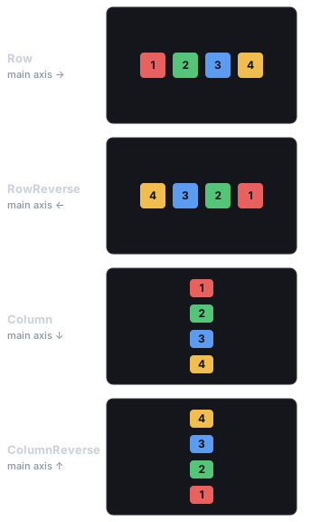
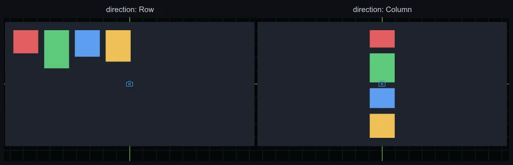
同样四个盒子在编辑器里的真实渲染——一个 Row 容器、一个 Column 容器。上面的示意图不是近似:引擎画出来就是这样。
justifyContent —— 子项沿主轴如何排布,以及多出来的空间如何分配:
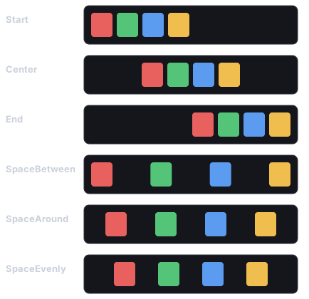
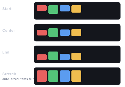
alignItems —— 子项沿交叉轴如何对齐。Stretch(默认)只拉伸交叉轴尺寸为 auto 的子项;
有固定尺寸的子项保持不变:
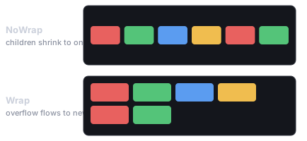
wrap —— 当子项在主轴上放不下时,NoWrap 通过 flexShrink 把它们压缩进一行;Wrap 保持
其尺寸、把溢出流到新行(这些行再由 alignContent 分配):
import { FlexContainer, FlexDirection, JustifyContent, AlignItems } from 'esengine';
world.insert(panel, FlexContainer, {  direction: FlexDirection.Column,  justifyContent: JustifyContent.Center,  alignItems: AlignItems.Center,  gap: { x: 0, y: 12 },  padding: { left: 16, top: 16, right: 16, bottom: 16 },});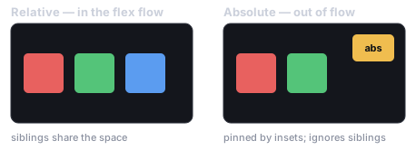
Relative 节点参与排布、与兄弟共享空间;Absolute 节点被抬出排布流、由内偏移(inset)钉住,浮在其余内容之上。
position: Absolute 使节点脱离 flex 流;四个内偏移相对父项的盒子放置它,与 CSS
left/top/right/bottom 完全一致:
- 钉住一条边——
insetTop: px(16), insetRight: px(16)把盒子放在距右上角 16px 处;auto的边不受约束,作者设置的width/height生效。 - 两边都钉住 +
auto尺寸——由内偏移决定尺寸:insetLeft: px(0), insetRight: px(0)配合width: auto()把盒子横向拉满父项。四个内偏移都为px(0)= 填满 父项(spawnUIEntity的node: { fill: true }写的就是这个)。 - 百分比内偏移与其他
Dimension一样,按父项对应轴解析。
用 auto 居中
Section titled “用 auto 居中”Absolute 节点在某轴上当该轴的两个内偏移和两个外边距全为 auto 时居中——
引擎把这种组合读作“把这个脱离流的节点在父盒中居中”。这是引擎在 Yoga 之上追加的
逐节点规则(Yoga 的绝对定位居中依赖父项的 justifyContent,无法逐兄弟不同),也是
无 pivot 的 CSS 盒唯一无法自行表达的锚点。每个轴独立解析,所以你可以水平居中的同时
钉住顶边。
import { spawnUIEntity, UIPositionType, px, auto } from 'esengine';
// Dead-center 320×220 panel: insets AND margins all auto on both axes.const panel = spawnUIEntity({  world,  node: {    position: UIPositionType.Absolute,    width: px(320), height: px(220),    marginLeft: auto(), marginRight: auto(),    marginTop: auto(), marginBottom: auto(),  },  visual: { color: { r: 0.08, g: 0.10, b: 0.16, a: 0.95 } },});
代码里的锚点预设
Section titled “代码里的锚点预设”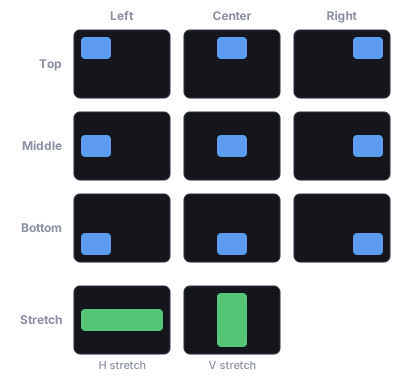
锚点选择器的九个点锚——各自把盒子钉到父项的某个角、边中点或正中心——外加每轴一个 Stretch,让盒子沿该轴铺满。
编辑器的锚点选择器——以及代码里的同一套 API——是一组写入上述盒字段的快捷方式。
锚点不是存储的状态:position/内偏移/外边距字段始终是唯一权威源,因此预设与实际
布局永远不会失同步。每个轴是四种模式之一:
AnchorAxis |
写入(逐轴) |
|---|---|
Start |
近端内偏移 px(0),远端内偏移 auto,外边距 px(0)——钉住左/上边。 |
Center |
两个内偏移和两个外边距全 auto——引擎居中(见上文)。 |
End |
远端内偏移 px(0),近端内偏移 auto,外边距 px(0)——钉住右/下边。 |
Stretch |
两个内偏移 px(0),外边距 px(0),尺寸 auto——由内偏移决定尺寸。 |
anchorPresetFields({ h, v }) 把预设解析为要写入的字段。它总是设置
position: Absolute 加四个内偏移和四个外边距;width/height 仅在 Stretch
轴上出现,因此非拉伸轴会保留你设置的尺寸。ANCHOR_AXES 按网格顺序列出四种模式
(用于构建预设选择器 UI)。
import {  UINode, AnchorAxis, anchorPresetFields, detectAnchor, detectAnchorAxes,} from 'esengine';
// Anchor a badge to the top-right corner.const node = world.get(badge, UINode);Object.assign(node, anchorPresetFields({ h: AnchorAxis.End, v: AnchorAxis.Start }));node.insetRight = { ...node.insetRight, value: 16 };  // 16px in from the rightnode.insetTop = { ...node.insetTop, value: 16 };world.insert(badge, UINode, node);
detectAnchor(node);      // → { h: AnchorAxis.End, v: AnchorAxis.Start }detectAnchorAxes(node);  // → per-axis; an axis is null when hand-tuned
detectAnchor(node) 把 UINode 归类回它匹配的预设——与 anchorPresetFields
往返一致——对 Relative 节点或不构成干净预设的盒子返回 null。
detectAnchorAxes(node) 逐轴独立归类(h/v,各为 AnchorAxis | null),因此一个
轴被手工调过的盒子,另一个轴仍可读取——并可保留。
布局时机与 UILayoutGeneration
Section titled “布局时机与 UILayoutGeneration”布局在 PreUpdate 运行(先于你的 Update 系统),并在 PostUpdate 中于滚动/列表
变更之后重新求解,因此游戏逻辑系统看到的几何总是最新的。每次求解都会递增
UILayoutGeneration 资源——一个单调计数器,你可以用它使任何基于计算后 UI 几何
的缓存失效(内置指针命中测试正是这么用的):
import { defineSystem, Res, UILayoutGeneration } from 'esengine';
let seen = -1;const trackLayout = defineSystem([Res(UILayoutGeneration)], (gen) => { if (gen.generation === seen) return; // layout unchanged since last frame seen = gen.generation; // Layout re-solved: re-read computed UI geometry, rebuild cached rects…});import { spawnUIEntity } from 'esengine';
const scrim = spawnUIEntity({ world, node: { fill: true }, // Absolute + all four insets px(0) visual: { color: { r: 0, g: 0, b: 0, a: 0.6 } },});居中一个面板
Section titled “居中一个面板”两种等价工具:给父项一个居中的 FlexContainer(justifyContent: Center, alignItems: Center——UI 快速上手的模式),或把面板本身设为
Absolute 且内偏移和外边距全 auto(Center 锚点——不需要父容器)。
HUD 角标
Section titled “HUD 角标”import { spawnUIEntity, UIPositionType, px } from 'esengine';
const badge = spawnUIEntity({ world, parent: hudRoot, node: { position: UIPositionType.Absolute, insetTop: px(16), insetRight: px(16), // other edges stay auto width: px(48), height: px(48), }, visual: { color: { r: 0.9, g: 0.2, b: 0.2, a: 1 } },});百分比宽度加像素上限——手机上流式,宽屏上封顶。min/max 不在 spawnUIEntity
的 init 里,直接在组件上设置:
import { spawnUIEntity, UINode, px, percent } from 'esengine';
const column = spawnUIEntity({ world, parent: root, node: { width: percent(90) } });const n = world.get(column, UINode);n.maxWidth = px(480);world.insert(column, UINode, n);
拉伸子项 / 弹性占位
Section titled “拉伸子项 / 弹性占位”alignItems 默认为 Stretch,所以 Row 的子项已经填满其高度。沿主轴用
flexGrow——一个只放大的占位符把兄弟项推开:
import { spawnUIEntity, FlexContainer, FlexDirection, px, percent } from 'esengine';
const toolbar = spawnUIEntity({ world, node: { height: px(48), width: percent(100) } });world.insert(toolbar, FlexContainer, {  direction: FlexDirection.Row,  gap: { x: 8, y: 0 }, padding: { left: 8, top: 4, right: 8, bottom: 4 },});
spawnUIEntity({ world, parent: toolbar, text: { content: 'Title' } });spawnUIEntity({ world, parent: toolbar, node: { flexGrow: 1 } }); // spacerspawnUIEntity({ world, parent: toolbar, text: { content: '99:59' } });spawnUIEntity 组合了三个纯构建器,你自己插入组件时也可以直接用——每个都把稀疏的
init 补全为完整的组件字面量:
buildUINode(init)——完整的UINodeData。fill: true是控件的常见情形:Absolute+ 全部内偏移px(0)。不带fill时默认是Relative+auto尺寸—— 注意spawnUIEntity不传nodeinit 时得到的就是这个相对 auto 盒,而不是 填满父项的盒。buildUIVisual(init)——完整的UIVisualData(默认:纯白)。buildText(init)——完整的TextData,采用控件风格的默认值(14px、居中、 不换行)——刻意区别于Text组件自身面向独立标签的默认值(24px、左/上、换行)。setUIVisible(world, entity, visible)——切换UIVisual.enabled(没有UIVisual时为 no-op)。要隐藏整棵子树,请改设UINode.display为UIDisplay.None。
import { UINode, UIVisual, buildUINode, buildUIVisual, px } from 'esengine';
const e = world.spawn();world.insert(e, UINode, buildUINode({ width: px(200), height: px(40) }));world.insert(e, UIVisual, buildUIVisual({ color: { r: 0.2, g: 0.2, b: 0.25, a: 1 } }));- Flex 优先——用容器、
flexGrow和percent表达布局;Absolute只留给 悬浮层、角标和浮动面板。 - 用预设做锚点——
anchorPresetFields替你写出正确的内偏移/外边距组合 (尤其是Center的全auto规则),不用死记。 - 绝不通过
Transform摆放 UI——布局趟每帧都会覆盖它;用内偏移和外边距移动盒子。 - 给流式尺寸封顶——
percent宽度配maxWidth: px(...),宽屏下才不失控。 - 隐藏子树用
display: None,隐藏单个视觉用UIVisual.enabled。